Most login pages are an afterthought — a white box, two fields, a button. This tutorial builds something completely different: a glassmorphism login form with a live particle constellation background, a 3D mouse-tilt card effect, and floating label inputs — all in pure HTML, CSS, and Vanilla JavaScript. No libraries, no frameworks, no dependencies beyond a Google Font and Font Awesome.
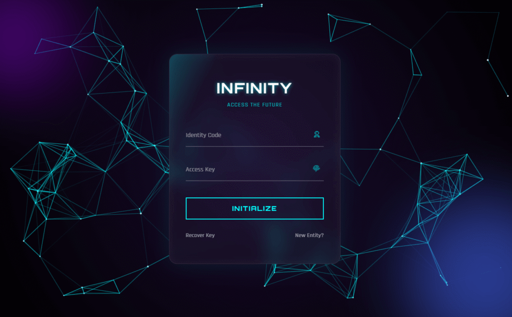
The finished result is called the Infinity Portal. It looks like a terminal on a spaceship. When you move your mouse, the stars connect into constellations and the login card tilts in 3D space as if it is floating in front of you.
▶ Live Demo
Move your mouse — see the 3D tilt + constellation effect
What This Login Form Includes
- HTML5 Canvas particle system — hundreds of floating star particles that connect into constellation lines when they come within range of each other, fully mouse-interactive
- Glassmorphism card — semi-transparent login card with
backdrop-filter: blur(), a subtle white border, and layered box-shadows to simulate frosted glass floating over the particle background - 3D mouse-tilt effect — the card rotates on both X and Y axes in response to cursor position using CSS
perspectiveand JavaScriptrotateX()/rotateY()transforms - Floating label inputs — labels sit inside the field at rest, then animate above it when the field is focused or filled — no extra JavaScript needed, achieved with CSS
:focusand:validselectors - Neon glowing button — transparent border button that fills with cyan on hover with a spreading
box-shadowglow - Animated light sweep — a
::beforepseudo-element on the card sweeps a skewed gradient across on hover, like a hologram scanner - Ambient orbs — two blurred radial colour blobs (purple and blue) that drift with a CSS
@keyframesanimation to add depth to the dark background - Zero dependencies — pure Vanilla JS, no jQuery, no Three.js, no canvas libraries
Files You Need to Create
Create a folder and add three files: index.html, style.css, and script.js. The full code for each is below.
1. index.html
<!DOCTYPE html>
<html lang="en">
<head>
    <meta charset="UTF-8">
    <meta name="viewport" content="width=device-width, initial-scale=1.0">
    <title>Infinity Portal Login</title>
    <link href="https://cdnjs.cloudflare.com/ajax/libs/font-awesome/6.4.0/css/all.min.css" rel="stylesheet">
    <link rel="stylesheet" href="style.css">
</head>
<body>

    <canvas id="universe"></canvas>

    <div class="orb orb-1"></div>
    <div class="orb orb-2"></div>

    <div class="container-3d" id="tiltContainer">
        <div class="login-card" id="tiltCard">
            <div class="content">
                <h2>INFINITY</h2>
                <p class="subtitle">ACCESS THE FUTURE</p>

                <form>
                    <div class="input-group">
                        <input type="text" required autocomplete="off">
                        <label>Identity Code</label>
                        <i class="fas fa-user-astronaut"></i>
                    </div>

                    <div class="input-group">
                        <input type="password" required>
                        <label>Access Key</label>
                        <i class="fas fa-fingerprint"></i>
                    </div>

                    <button type="submit" class="btn-glow">Initialize</button>

                    <div class="footer-links">
                        <a href="#">Recover Key</a>
                        <a href="#">New Entity?</a>
                    </div>
                </form>
            </div>
        </div>
    </div>

    <script src="script.js"></script>
</body>
</html>
2. style.css
@import url('https://fonts.googleapis.com/css2?family=Orbitron:wght@400;500;700&family=Rajdhani:wght@300;500;700&display=swap');

* { margin: 0; padding: 0; box-sizing: border-box; }

body {
    overflow: hidden;
    background: #000;
    font-family: 'Rajdhani', sans-serif;
    height: 100vh;
    display: flex;
    justify-content: center;
    align-items: center;
}

/* --- Canvas Background --- */
#universe {
    position: absolute; top: 0; left: 0;
    width: 100%; height: 100%; z-index: 0;
    background: radial-gradient(circle at center, #1a0b2e 0%, #000000 100%);
}

/* --- 3D Container & Card --- */
.container-3d {
    position: relative; z-index: 10; perspective: 1000px;
}

.login-card {
    width: 420px; padding: 60px 40px;
    background: rgba(255, 255, 255, 0.03);
    border-radius: 20px;
    backdrop-filter: blur(20px); -webkit-backdrop-filter: blur(20px);
    border: 1px solid rgba(255, 255, 255, 0.1);
    box-shadow: 0 0 50px rgba(0, 255, 255, 0.1), inset 0 0 20px rgba(255, 255, 255, 0.05);
    transform-style: preserve-3d;
    transition: transform 0.1s ease;
    position: relative; overflow: hidden;
}

/* Glowing Border Sweep Animation */
.login-card::before {
    content: ''; position: absolute; top: 0; left: -100%;
    width: 100%; height: 100%;
    background: linear-gradient(90deg, transparent, rgba(0, 255, 255, 0.4), transparent);
    transition: 0.5s; transform: skewX(-25deg); pointer-events: none;
}
.login-card:hover::before { left: 100%; transition: 0.7s; }

.content { transform: translateZ(60px); }

/* Typography */
h2 {
    color: #fff; font-family: 'Orbitron', sans-serif; font-size: 2.2rem;
    text-align: center; margin-bottom: 10px; letter-spacing: 3px;
    text-transform: uppercase; text-shadow: 0 0 10px rgba(0, 255, 255, 0.7);
}
p.subtitle {
    color: rgba(0, 255, 255, 0.7); text-align: center; margin-bottom: 40px;
    font-size: 0.9rem; letter-spacing: 1px;
}

/* Floating Label Inputs */
.input-group { position: relative; margin-bottom: 30px; }
.input-group input {
    width: 100%; padding: 15px 10px; background: transparent; border: none;
    border-bottom: 2px solid rgba(255, 255, 255, 0.2);
    color: #fff; font-size: 1.1rem; font-family: 'Rajdhani', sans-serif;
    outline: none; transition: 0.3s;
}
.input-group label {
    position: absolute; top: 15px; left: 0; color: rgba(255, 255, 255, 0.5);
    pointer-events: none; transition: 0.3s; font-size: 1rem;
}
.input-group input:focus,
.input-group input:valid {
    border-bottom-color: #00ffff; text-shadow: 0 0 8px rgba(0, 255, 255, 0.5);
}
.input-group input:focus ~ label,
.input-group input:valid ~ label {
    top: -20px; color: #00ffff; font-size: 0.8rem;
}
.input-group i {
    position: absolute; right: 10px; top: 15px; color: #00ffff; opacity: 0.5;
}

/* Neon Glow Button */
.btn-glow {
    width: 100%; padding: 15px; background: transparent;
    color: #00ffff; border: 2px solid #00ffff;
    font-family: 'Orbitron', sans-serif; font-size: 1rem; letter-spacing: 2px;
    text-transform: uppercase; cursor: pointer; transition: 0.3s;
    margin-top: 10px; font-weight: bold;
}
.btn-glow:hover {
    background: #00ffff; color: #000; box-shadow: 0 0 20px #00ffff;
}

/* Footer Links */
.footer-links { margin-top: 30px; display: flex; justify-content: space-between; font-size: 0.9rem; }
.footer-links a { color: rgba(255, 255, 255, 0.6); text-decoration: none; transition: 0.3s; }
.footer-links a:hover { color: #fff; }

/* Ambient Orbs */
.orb {
    position: absolute; border-radius: 50%; filter: blur(80px); z-index: 1; opacity: 0.6;
    animation: floatOrb 10s infinite alternate;
}
.orb-1 { top: -10%; left: -10%; width: 300px; height: 300px; background: #7209b7; }
.orb-2 { bottom: -10%; right: -10%; width: 400px; height: 400px; background: #4361ee; }
@keyframes floatOrb {
    0% { transform: translate(0, 0); }
    100% { transform: translate(30px, 50px); }
}
3. script.js
// --- 1. UNIVERSE PARTICLE SYSTEM ---
const canvas = document.getElementById('universe');
const ctx = canvas.getContext('2d');
canvas.width = window.innerWidth;
canvas.height = window.innerHeight;

let particlesArray;

class Particle {
    constructor(x, y, directionX, directionY, size, color) {
        this.x = x; this.y = y;
        this.directionX = directionX; this.directionY = directionY;
        this.size = size; this.color = color;
    }
    draw() {
        ctx.beginPath();
        ctx.arc(this.x, this.y, this.size, 0, Math.PI * 2, false);
        ctx.fillStyle = this.color;
        ctx.fill();
    }
    update() {
        if (this.x > canvas.width || this.x < 0) this.directionX = -this.directionX;
        if (this.y > canvas.height || this.y < 0) this.directionY = -this.directionY;
        this.x += this.directionX;
        this.y += this.directionY;
        this.draw();
    }
}

function init() {
    particlesArray = [];
    let numberOfParticles = (canvas.height * canvas.width) / 9000;
    for (let i = 0; i < numberOfParticles; i++) {
        let size = (Math.random() * 2) + 0.1;
        let x = (Math.random() * ((innerWidth - size * 2) - (size * 2)) + size * 2);
        let y = (Math.random() * ((innerHeight - size * 2) - (size * 2)) + size * 2);
        let directionX = (Math.random() * 0.4) - 0.2;
        let directionY = (Math.random() * 0.4) - 0.2;
        let color = '#ffffff';
        particlesArray.push(new Particle(x, y, directionX, directionY, size, color));
    }
}

function connect() {
    let opacityValue = 1;
    for (let a = 0; a < particlesArray.length; a++) {
        for (let b = a; b < particlesArray.length; b++) {
            let distance = ((particlesArray[a].x - particlesArray[b].x) * (particlesArray[a].x - particlesArray[b].x)) +
                           ((particlesArray[a].y - particlesArray[b].y) * (particlesArray[a].y - particlesArray[b].y));

            if (distance < (canvas.width / 7) * (canvas.height / 7)) {
                opacityValue = 1 - (distance / 20000);
                ctx.strokeStyle = 'rgba(0, 255, 255,' + opacityValue + ')';
                ctx.lineWidth = 1;
                ctx.beginPath();
                ctx.moveTo(particlesArray[a].x, particlesArray[a].y);
                ctx.lineTo(particlesArray[b].x, particlesArray[b].y);
                ctx.stroke();
            }
        }
    }
}

function animate() {
    requestAnimationFrame(animate);
    ctx.clearRect(0, 0, innerWidth, innerHeight);
    for (let i = 0; i < particlesArray.length; i++) {
        particlesArray[i].update();
    }
    connect();
}

window.addEventListener('resize', function() {
    canvas.width = innerWidth;
    canvas.height = innerHeight;
    init();
});

init();
animate();

// --- 2. 3D TILT EFFECT ---
const container = document.getElementById('tiltContainer');
const card = document.getElementById('tiltCard');

document.addEventListener('mousemove', (e) => {
    let xAxis = (window.innerWidth / 2 - e.pageX) / 25;
    let yAxis = (window.innerHeight / 2 - e.pageY) / 25;
    card.style.transform = `rotateY(${xAxis}deg) rotateX(${yAxis}deg)`;
});

container.addEventListener('mouseenter', () => {
    card.style.transition = 'none';
});
container.addEventListener('mouseleave', () => {
    card.style.transition = 'all 0.5s ease';
    card.style.transform = 'rotateY(0deg) rotateX(0deg)';
});
How Every Effect Works — Technical Breakdown
The HTML5 Canvas Particle System
The background is a live <canvas> element that sits behind everything else at z-index: 0. The JavaScript creates a Particle class where each instance stores a position (x, y), a direction vector (directionX, directionY), and a size.
The init() function calculates how many particles to spawn based on the viewport area — (width * height) / 9000 — so the density stays consistent regardless of screen size. Each particle bounces off the canvas edges by inverting its direction when it hits a boundary.
The connect() function is the constellation effect. It loops through every pair of particles and calculates the squared distance between them using the Pythagorean theorem. If two particles are closer than a threshold based on canvas dimensions, a cyan line is drawn between them. The line’s opacity is calculated as 1 - (distance / 20000), so nearby particles connect with bright lines and distant ones with near-invisible ones — exactly how constellations look against a night sky.
The whole system runs in a requestAnimationFrame loop, which keeps animation in sync with the browser’s natural repaint cycle for smooth 60fps rendering.
The Glassmorphism Card
Glassmorphism requires three properties working together:
background: rgba(255, 255, 255, 0.03)— an almost transparent white fill that lets the particle background show through while giving the card its own surfacebackdrop-filter: blur(20px)— blurs everything behind the card, creating the frosted glass look. This is the key property. The-webkit-prefix is included for Safari compatibility.border: 1px solid rgba(255, 255, 255, 0.1)— a thin semi-transparent white border that catches light and defines the card edge without looking solid
The outer box-shadow with cyan colour (0 0 50px rgba(0,255,255,0.1)) creates the ambient neon glow around the card perimeter, and the inset shadow adds a subtle inner glow that makes the glass look lit from within.
The 3D Mouse Tilt Effect
The tilt works by reading the mouse position relative to the centre of the viewport, then applying that as a rotation angle to the card. The maths is:
let xAxis = (window.innerWidth / 2 - e.pageX) / 25;
let yAxis = (window.innerHeight / 2 - e.pageY) / 25;
window.innerWidth / 2 is the horizontal centre of the screen. Subtracting the mouse’s pageX gives a value that is positive when the mouse is left of centre and negative when right. Dividing by 25 scales the range down to roughly ±20 degrees, which is enough tilt to feel dramatic without making the card flip. The same logic applies to the Y axis.
Two things make the tilt feel natural rather than mechanical. First, the outer container has perspective: 1000px — without a perspective value, CSS 3D transforms look flat and fake. Second, the card’s transition is set to none while the mouse is over the container (so the card tracks instantly) but restored to all 0.5s ease when the mouse leaves (so it springs smoothly back to flat).
The transform-style: preserve-3d on the card and transform: translateZ(60px) on the inner content push the text and inputs visually forward in 3D space, enhancing the depth illusion.
Floating Label Inputs
The label sits inside the field by default (position: absolute; top: 15px). When the input is focused or contains a value (:focus and :valid selectors), the label animates up to top: -20px and shrinks. The entire animation is CSS — no JavaScript touches the inputs at all. The required attribute on the input is what makes :valid work — without it, the field is considered valid even when empty and the label would float up on page load.
The Hologram Sweep on Hover
The .login-card::before pseudo-element is a skewed gradient that starts off-screen to the left (left: -100%). On hover, it transitions to left: 100%, sweeping across the card face. The transform: skewX(-25deg) angles it diagonally so it looks like a scanner beam rather than a straight wipe. It is set to pointer-events: none so it does not interfere with clicking the form elements.
How to Customise the Infinity Portal
Change the neon colour
The cyan colour #00ffff and its rgba equivalent rgba(0, 255, 255, ...) appear throughout both the CSS and the connect() function in JavaScript. To switch to a different neon — hot pink #ff00ff, electric green #39ff14, or orange #ff6600 — do a find-and-replace across both files. In the JS, update the ctx.strokeStyle line to use your colour’s RGB values.
Change the card width
The card is fixed at width: 420px. For a wider card on desktop (common for sign-up forms with more fields), increase this to 480px or 520px. For a tighter, more mobile-friendly layout, drop it to 360px.
Remove the particle background
Delete the entire particle system section from script.js (everything above the 3D tilt comment), remove the <canvas id="universe"> element from the HTML, and replace the canvas background gradient in the CSS with a solid dark background on body. The glassmorphism card and 3D tilt continue to work independently.
Remove the 3D tilt
Delete the tilt section from script.js (the last 12 lines), remove perspective: 1000px from .container-3d, and set transform-style: flat on .login-card. The card becomes static but all other effects remain.
Change the particle density
In script.js, find (canvas.height * canvas.width) / 9000 in the init() function. A higher divisor (e.g. 15000) gives fewer, more spread-out stars. A lower divisor (e.g. 6000) creates a denser star field — but watch performance on lower-end devices.
Change the constellation connection distance
In the connect() function, the threshold is (canvas.width/7) * (canvas.height/7). Decrease the divisor (e.g. /5) to connect more particles and create a denser web. Increase it (e.g. /10) for sparser, longer-distance connections.
Where to Use This Design
- Developer portfolio sites — placing this as the login page for a private portfolio section immediately signals to clients that you understand advanced CSS and JavaScript. It doubles as a demo of your own skills.
- Gaming or app dashboards — any product with a sci-fi, cyberpunk, or space theme benefits from this aesthetic. The particle background scales to any screen size and adapts automatically.
- Agency client demos — when pitching a custom web application to a client, opening with a polished login screen like this sets expectations for the quality of the build. It costs almost nothing to implement but makes a large impression.
- SaaS onboarding screens — for SaaS products targeting technical users (developers, data scientists, security professionals), a terminal-aesthetic login page reinforces brand credibility and product sophistication.
- Hackathon projects — this template can be dropped into any hackathon project in under 5 minutes to give it an immediately professional front-end before you focus on the back-end logic.
Performance Note
The particle system runs an O(n²) comparison loop in connect() — it checks every particle against every other particle on every frame. On a typical 1080p screen this generates around 120–150 particles, meaning roughly 7,000–11,000 comparisons per frame. This is imperceptible on any modern device but can cause noticeable lag on lower-end phones or devices with shared GPU memory.
If you deploy this on a site where mobile performance matters, add a device check before calling init():
// Reduce particle density on mobile
const isMobile = window.innerWidth < 768;
const densityDivisor = isMobile ? 18000 : 9000;
let numberOfParticles = (canvas.height * canvas.width) / densityDivisor;
Need it built for you?
Want a Custom Animated Login Page or Full Web App?
I build custom interactive UI components, animated login screens, and complete front-end builds to your spec. If you need this connected to a real backend — WordPress, Node.js, or anything else — I can handle the full stack. Starting at $10 on Fiverr.
More CSS + JS UI Components
- Cyberpunk Glitch Card CSS — 3D tilt + glitch text animation, similar technique applied to a profile card
- Pure CSS Neon Button — the exact button style used in this login form, with 4 colour variants and a pulse animation
- Mastering the CSS Glitch Effect — deep dive into the
clip+@keyframesglitch technique to pair with this login page - Responsive Newspaper Website Template — free HTML/CSS news portal homepage, 2 styles included
Conclusion
The Infinity Portal is built entirely from techniques you already know — canvas, CSS transforms, backdrop-filter, pseudo-elements, and event listeners. What makes it feel special is not any single effect but how all five layers work together: the particles set the atmosphere, the glassmorphism grounds the card, the tilt creates presence, the floating labels add polish, and the sweep adds surprise.
All of it in under 200 lines of CSS and 80 lines of JavaScript.
Grab the code from the CodePen demo above, customise the colour to match your project, and drop it in. Happy coding 🚀

Comments are closed.