You’ve seen those glowing, glitching UI cards in cyberpunk games and sci-fi movies. In this tutorial, you will build one from scratch — a 3D interactive cyberpunk glitch card that reacts to your mouse and features a neon text glitch animation. No libraries. Just HTML, CSS, and a few lines of JavaScript.
This is the exact kind of UI component that impresses clients and looks incredible in a developer portfolio. I’ll give you the complete source code for both a Pure CSS version (no JavaScript at all) and a JavaScript version with real-time mouse tracking.
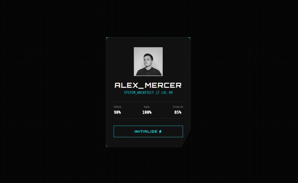
What You Will Build
The final card includes four signature effects that make it look genuinely professional:
- Glitch text animation — CSS
::beforeand::afterpseudo-elements split and offset the title text, animated with@keyframesand theclipproperty to simulate a corrupted display signal. - 3D mouse tilt — JavaScript tracks the cursor position and maps it to
rotateXandrotateYtransforms, giving the card a real sense of depth. - Angled clip-path corners —
clip-path: polygon()cuts the card corners at an angle for that sharp, industrial sci-fi look you see in games like Cyberpunk 2077. - Neon hover effects — The avatar desaturates on load and snaps to full colour on hover. The button fills with a sliding cyan glow.
The Pure CSS version achieves the 3D tilt without any JavaScript using a clever 5×5 grid of invisible <a> elements as hover zones — a technique worth understanding on its own.
Step 1 — The HTML Structure
The structure is the same for both versions. Notice the data-text attribute on the h2 — CSS reads this via attr(data-text) to duplicate the text in pseudo-elements without any JavaScript.
<!DOCTYPE html>
<html lang="en">
<head>
    <meta charset="UTF-8">
    <title>Cyberpunk Glitch Card</title>
    <link href="https://cdnjs.cloudflare.com/ajax/libs/font-awesome/6.0.0/css/all.min.css" rel="stylesheet">
</head>
<body>

<div class="container">
    <div class="card" id="cyber-card">
        <div class="card-content">

            <div class="glitch-wrapper">
                <img src="https://images.unsplash.com/photo-1535713875002-d1d0cf377fde?q=80&w=1000"
                     alt="Cyber Avatar" class="avatar">
            </div>

            <!-- data-text must match the visible text exactly -->
            <h2 class="cyber-title" data-text="ALEX_MERCER">ALEX_MERCER</h2>
            <p class="cyber-role">SYSTEM_ARCHITECT // LVL.99</p>

            <div class="stats">
                <div class="stat-box">
                    <span class="label">SPEED</span>
                    <span class="value">98%</span>
                </div>
                <div class="stat-box">
                    <span class="label">HACK</span>
                    <span class="value">100%</span>
                </div>
                <div class="stat-box">
                    <span class="label">STEALTH</span>
                    <span class="value">85%</span>
                </div>
            </div>

            <button class="cyber-btn">INITIALIZE <i class="fas fa-bolt"></i></button>
        </div>

        <!-- Decorative corner accents -->
        <div class="corner top-left"></div>
        <div class="corner top-right"></div>
        <div class="corner bottom-left"></div>
        <div class="corner bottom-right"></div>
    </div>
</div>

</body>
</html>
Step 2 — The CSS (Glitch Effect + Neon Styling)
Two CSS variables — --primary (cyan) and --secondary (pink) — control the entire colour scheme. Change these two values to completely retheme the card.
The glitch effect is the most technically interesting part. The ::before and ::after pseudo-elements each contain the same text as the title. They are positioned on top of the real text with a slight horizontal offset and a different text-shadow colour. The clip property then shows only a random horizontal slice of each, while the @keyframes animation rapidly changes which slice is visible — giving the impression of a corrupted digital signal.
@import url('https://fonts.googleapis.com/css2?family=Orbitron:wght@400;700;900&family=Share+Tech+Mono&display=swap');

:root {
    --primary:   #00f3ff; /* Neon Cyan  */
    --secondary: #ff0055; /* Neon Pink  */
    --bg:        #050505;
    --card-bg:   #111;
}

* { box-sizing: border-box; margin: 0; padding: 0; }

body {
    background-color: var(--bg);
    /* Subtle grid pattern using CSS gradients — no image needed */
    background-image:
        linear-gradient(rgba(0, 243, 255, 0.03) 1px, transparent 1px),
        linear-gradient(90deg, rgba(0, 243, 255, 0.03) 1px, transparent 1px);
    background-size: 30px 30px;
    height: 100vh;
    display: flex;
    justify-content: center;
    align-items: center;
    font-family: 'Share Tech Mono', monospace;
    overflow: hidden;
}

/* Perspective container for the 3D tilt */
.container { perspective: 1000px; }

.card {
    width: 350px;
    padding: 40px 30px;
    background: var(--card-bg);
    border: 1px solid rgba(0, 243, 255, 0.2);
    position: relative;
    transform-style: preserve-3d;
    cursor: pointer;
    box-shadow: 0 0 20px rgba(0, 243, 255, 0.1);
    /* clip-path creates the angled bottom-right corner */
    clip-path: polygon(0 0, 100% 0, 100% 85%, 90% 100%, 0 100%);
}

/* ── Avatar ── */
.glitch-wrapper {
    width: 120px;
    height: 120px;
    margin: 0 auto 20px;
    position: relative;
}

.avatar {
    width: 100%; height: 100%;
    object-fit: cover;
    border: 2px solid var(--primary);
    filter: grayscale(100%);  /* greyscale until hover */
    transition: 0.3s;
}

.card:hover .avatar {
    filter: grayscale(0%);          /* colour on hover */
    border-color: var(--secondary);
}

/* ── Glitch Text Effect ── */
.cyber-title {
    font-family: 'Orbitron', sans-serif;
    color: #fff;
    text-align: center;
    font-size: 1.8rem;
    margin-bottom: 5px;
    position: relative;
    letter-spacing: 2px;
}

/* Both pseudo-elements sit on top of the title */
.cyber-title::before,
.cyber-title::after {
    content: attr(data-text); /* reads the data-text attribute */
    position: absolute;
    top: 0; left: 0;
    width: 100%; height: 100%;
    background: var(--card-bg); /* hides everything outside the clip */
}

/* Pink offset layer */
.cyber-title::before {
    left: 2px;
    text-shadow: -1px 0 var(--secondary);
    clip: rect(24px, 550px, 90px, 0);
    animation: glitch-2 3s infinite linear alternate-reverse;
}

/* Cyan offset layer */
.cyber-title::after {
    left: -2px;
    text-shadow: -1px 0 var(--primary);
    clip: rect(85px, 550px, 140px, 0);
    animation: glitch-1 2.5s infinite linear alternate-reverse;
}

/* ── Role text ── */
.cyber-role {
    text-align: center;
    color: var(--primary);
    font-size: 0.9rem;
    margin-bottom: 30px;
    opacity: 0.8;
}

/* ── Stats row ── */
.stats {
    display: flex;
    justify-content: space-between;
    margin-bottom: 30px;
    border-top: 1px solid rgba(255,255,255,0.1);
    border-bottom: 1px solid rgba(255,255,255,0.1);
    padding: 15px 0;
}

.stat-box { text-align: center; }
.stat-box .label { display: block; font-size: 0.7rem; color: #888; margin-bottom: 5px; }
.stat-box .value { font-size: 1.1rem; color: #fff; font-weight: bold; }

/* ── CTA Button with fill-sweep hover ── */
.cyber-btn {
    width: 100%;
    padding: 15px;
    background: transparent;
    border: 1px solid var(--primary);
    color: var(--primary);
    font-family: 'Orbitron', sans-serif;
    font-weight: bold;
    letter-spacing: 2px;
    cursor: pointer;
    position: relative;
    overflow: hidden;
    transition: 0.3s;
}

.cyber-btn::before {
    content: '';
    position: absolute;
    top: 0; left: -100%;
    width: 100%; height: 100%;
    background: var(--primary);
    transition: 0.3s;
    z-index: -1;
}

.cyber-btn:hover { color: #000; box-shadow: 0 0 15px var(--primary); }
.cyber-btn:hover::before { left: 0; }

/* ── Corner accents ── */
.corner {
    position: absolute;
    width: 10px; height: 10px;
    border: 2px solid var(--primary);
    transition: 0.3s;
}
.top-left    { top: -2px; left: -2px;   border-right: none; border-bottom: none; }
.top-right   { top: -2px; right: -2px;  border-left: none;  border-bottom: none; }
.bottom-left { bottom: -2px; left: -2px; border-right: none; border-top: none; }
.bottom-right {
    bottom: -2px; right: -2px;
    border-left: none; border-top: none;
    width: 20px;
    border-color: var(--secondary); /* pink accent on bottom-right */
}

.card:hover .corner { width: 100%; height: 100%; opacity: 0.1; }

/* ── Glitch keyframes ── */
@keyframes glitch-1 {
    0%   { clip: rect(10px, 9999px, 30px, 0);  transform: skew(0.5deg); }
    10%  { clip: rect(50px, 9999px, 70px, 0);  transform: skew(0.2deg); }
    20%  { clip: rect(20px, 9999px, 60px, 0);  transform: skew(0.8deg); }
    100% { clip: rect(80px, 9999px, 100px, 0); transform: skew(0.1deg); }
}

@keyframes glitch-2 {
    0%   { clip: rect(60px, 9999px, 80px, 0);  transform: skew(0.6deg); }
    10%  { clip: rect(10px, 9999px, 30px, 0);  transform: skew(0.3deg); }
    100% { clip: rect(90px, 9999px, 100px, 0); transform: skew(0.1deg); }
}
Step 3 — The JavaScript (Real-Time 3D Mouse Tilt)
The tilt calculation maps the cursor’s X/Y position relative to the window centre to a rotation angle. The further the mouse is from centre, the more the card tilts. Dividing by 20 controls the maximum tilt intensity — lower the number for a more dramatic effect, increase it for subtler movement.
const card = document.getElementById('cyber-card');

document.addEventListener('mousemove', (e) => {
    // Map cursor position to rotation angles
    // Dividing by 20 limits max tilt to ~±15 degrees
    const xAxis = (window.innerWidth  / 2 - e.pageX) / 20;
    const yAxis = (window.innerHeight / 2 - e.pageY) / 20;

    card.style.transform = `rotateY(${xAxis}deg) rotateX(${yAxis}deg)`;
});

// Disable transition while mouse is over the card (feels more responsive)
card.addEventListener('mouseenter', () => {
    card.style.transition = 'none';
});

// Re-enable transition on mouse leave to animate back to flat
card.addEventListener('mouseleave', () => {
    card.style.transition = 'all 0.5s ease';
    card.style.transform  = 'rotateY(0deg) rotateX(0deg)';
});
The Pure CSS 3D Tilt Trick (No JavaScript)
The CSS-only tilt works using a 5×5 grid of invisible, overlapping <a> elements positioned on top of the card. Each cell has a :hover ~ .card sibling selector that applies a specific rotateX() rotateY() transform. When your mouse crosses into a different cell, a different rotation value fires.
It’s not as smooth as the JavaScript version (you get 25 discrete tilt positions instead of continuous tracking), but it works with zero JavaScript — useful for environments where scripts are restricted or for impressing people with what pure CSS can do.
The full Pure CSS source code is available on CodePen:
→ View Pure CSS Version on CodePen
How to Customise This Card
The design is built around CSS variables, making it very easy to retheme without touching the animation code:
- Change colour scheme: Edit
--primaryand--secondaryin:root. Try#39ff14(neon green) and#ff6600(orange) for a different cyberpunk palette. - Change corner shape: Edit the
clip-path: polygon()values. Adding more points lets you cut multiple corners. - Adjust glitch speed: Change the animation duration on
.cyber-title::beforeand::after. Lower values = more aggressive glitch. - Adjust tilt intensity: In the JavaScript, change the divisor
/ 20. Use/ 10for aggressive tilt or/ 40for very subtle. - Replace the avatar: Swap the
srcof the.avatarimage. Keep it square for best results with the circular border.
Where to Use This Component
This card style works well in several real-world contexts:
- Developer portfolios — Showcase your profile or skills section with an interactive card that stands out from the usual flat design.
- Gaming websites and dashboards — Player profiles, character stats, or leaderboard cards fit this aesthetic perfectly.
- Product launch pages — Tech products, SaaS apps, and hardware brands often use this cyberpunk aesthetic to signal innovation.
- Agency / freelancer portfolios — Show potential clients you can execute complex UI effects that other developers charge premium rates for.
Need this built for your project?
Want a Custom Cyberpunk UI or WordPress Site?
I build custom CSS animations, interactive UI components, and high-performance WordPress websites. If you need something like this built professionally for a client or your own project, I can help.
Conclusion
The three core CSS techniques used here — clip-path for shaped containers, clip + @keyframes for the glitch text effect, and transform-style: preserve-3d for depth — are all worth knowing for any frontend developer. They appear regularly in modern UI design and are easy to adapt once you understand the pattern.
Grab the code from CodePen, change the colours to match your brand, and make it your own. If you build something with it or have a question about any of the techniques, leave a comment below.
Happy coding 👾
If you liked this, you might also enjoy the Futuristic Login Form tutorial — it uses similar neon CSS effects with a particle background built in vanilla JavaScript.

Comments are closed.