The UI of Cyberpunk 2077, Blade Runner interfaces, and sci-fi terminal screens all share one visual signature: that glitchy, flickering text effect where a second layer of the same word tears sideways in a contrasting colour. It signals “high-tech instability” — and it looks incredible on portfolio sites, gaming landing pages, 404 pages, and dark-mode developer sites.
The good news: this effect is pure CSS. No JavaScript animation libraries, no canvas, no SVG filters. Just clip-path, pseudo-elements, and a @keyframes block.
This tutorial breaks down every line — what it does, why it’s there, and what happens if you remove it. By the end you will understand the technique well enough to apply it to any element: headings, cards, nav links, hero text.
1. The HTML Structure
The entire effect relies on a single HTML attribute: data-text. To create a glitch, we need two layers of the same text — a real layer and a ghost layer. Instead of writing the text twice in HTML (which confuses screen readers and looks messy), we store the duplicate in a data attribute and let CSS retrieve it.
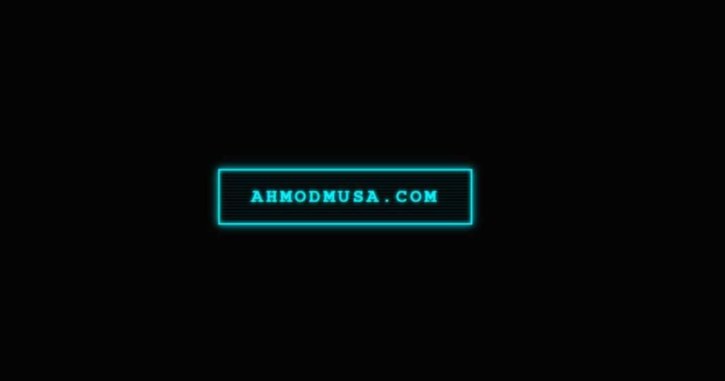
<a href="#" class="cyber-link" data-text="ahmodmusa.com">
  ahmodmusa.com
</a>
The value of data-text must match the visible text exactly. Later, content: attr(data-text) in the ::after pseudo-element pulls this value and renders the ghost layer automatically — no extra markup needed.
2. Base Styling — The Neon Glow
The foundation is a border + text combination that glows using layered box-shadow and text-shadow. The cyan colour (#00f7ff) is the classic cyberpunk hue — it sits at the blue-green boundary where it reads as “digital” and “electric” simultaneously.
.cyber-link {
  position: relative;       /* Required: anchors the absolute pseudo-elements */
  display: inline-block;
  text-decoration: none;
  font-size: 24px;
  color: #00f7ff;
  border: 2px solid #00f7ff;
  padding: 20px 40px;
  text-transform: uppercase;
  letter-spacing: 4px;      /* Wide tracking reads as cinematic/futuristic */
  font-weight: bold;
  overflow: hidden;          /* Clips pseudo-elements to the button's bounds */
  transition: 0.2s;
  z-index: 1;

  /* Layered neon glow */
  text-shadow: 0 0 5px #00f7ff;
  box-shadow:
    0 0 10px #00f7ff,        /* Outer glow */
    inset 0 0 5px #00f7ff;  /* Inner glow — creates the glass-tube effect */
}
The inset value on box-shadow is what separates a flat neon border from a proper glowing tube. Without it the glow only radiates outward. With it, the button interior also catches light, making it feel like a physical neon sign rather than a CSS border.
3. The Scanline Texture — Retro Monitor Feel
Old CRT monitors projected images line by line, leaving faint horizontal bands across the screen. Simulating this adds depth and signals “this UI belongs to a physical terminal in a dystopian future.” We use ::before and a repeating-linear-gradient to draw the stripes.
.cyber-link::before {
  content: '';
  position: absolute;
  top: 0; left: 0;
  width: 100%; height: 100%;

  /* Alternating transparent / faint cyan stripes every 4px */
  background: repeating-linear-gradient(
    0deg,
    transparent,
    transparent 2px,
    rgba(0, 247, 255, 0.07) 3px,
    rgba(0, 247, 255, 0.07) 4px
  );

  z-index: -1;           /* Sits behind the text */
  pointer-events: none;  /* Does not interfere with hover/click events */
}
The opacity of 0.07 keeps the scanlines subtle — you want the texture to be felt, not seen. If you increase it above 0.15 the stripes become distracting. Remove the ::before block entirely if you prefer a clean flat look; the glitch animation works independently of this layer.
4. The Glitch Layer — Where the Magic Happens
This is the core technique. The ::after pseudo-element renders a second copy of the text in magenta (#ff00ea) positioned directly on top of the real text. It stays hidden by default. The clip-path property is what makes it look like a glitch rather than just a colour-shifted duplicate — it cuts out only a horizontal strip of the text, making it appear as a torn, displaced slice.
.cyber-link::after {
  content: attr(data-text);  /* Pulls text from the data-text attribute */
  position: absolute;
  top: 0;
  left: -2px;                /* 2px offset left — creates the displacement */
  width: 100%;
  height: 100%;
  padding: 20px 40px;        /* Must match the parent's padding exactly */
  background: #050505;       /* Covers the real text beneath the slice */
  color: #ff00ea;            /* Glitch colour — magenta contrasts cyan */
  border: 2px solid #ff00ea;
  z-index: -2;
  opacity: 0;                /* Hidden until hover */
  transition: opacity 0.1s;

  /* Clips to show only the 20%→50% vertical band of the text */
  clip-path: polygon(0 20%, 100% 20%, 100% 50%, 0 50%);
}
Understanding clip-path here: polygon(0 20%, 100% 20%, 100% 50%, 0 50%) defines a rectangle by its four corners: top-left (0, 20%), top-right (100%, 20%), bottom-right (100%, 50%), bottom-left (0, 50%). This exposes only the middle 30% of the element’s height — like cutting a horizontal strip through the text. The rest is clipped invisible. The animation changes these percentage values rapidly to make the slice jump up and down.
5. Hover & Animation
On hover, three things happen simultaneously: the button inverts to a solid cyan fill (the classic “pressed neon” look), the glitch layer becomes visible, and a keyframe animation rapidly changes the clip-path and transform values to create the jitter.
/* Inverted fill on hover */
.cyber-link:hover {
  background: #00f7ff;
  color: #050505;
  box-shadow: 0 0 30px #00f7ff, 0 0 60px rgba(0, 247, 255, 0.3);
  text-shadow: none;
}

/* Reveal and animate the glitch layer */
.cyber-link:hover::after {
  opacity: 1;
  left: 4px;   /* Shifts to +4px on hover (was -2px at rest — 6px total shift) */
  animation: glitch-jerk 0.3s linear infinite alternate;
}

@keyframes glitch-jerk {
  0% {
    clip-path: polygon(0 20%, 100% 20%, 100% 50%, 0 50%);
    transform: translate(0);
  }
  33% {
    clip-path: polygon(0 5%, 100% 5%, 100% 25%, 0 25%);
    transform: translate(-3px, 1px);
  }
  66% {
    clip-path: polygon(0 60%, 100% 60%, 100% 80%, 0 80%);
    transform: translate(2px, -1px);
  }
  100% {
    clip-path: polygon(0 35%, 100% 35%, 100% 55%, 0 55%);
    transform: translate(-1px);
  }
}
The original tutorial used 3 keyframe steps. The version above uses 4 steps, which makes the jitter feel less rhythmic and more authentically glitchy — real data corruption does not repeat evenly. The alternate direction keyword means the animation plays forward then reverses, doubling the apparent number of positions without adding more keyframes.
Complete Copy-Paste Code
Save this as an .html file and open it in your browser, or drop the CSS into your existing stylesheet.
<!DOCTYPE html>
<html lang="en">
<head>
<meta charset="UTF-8">
<meta name="viewport" content="width=device-width, initial-scale=1.0">
<title>Cyberpunk Glitch Effect</title>
<style>
  body {
    margin: 0;
    min-height: 100vh;
    display: flex;
    justify-content: center;
    align-items: center;
    background: #050505;
    font-family: 'Courier New', monospace;
    gap: 40px;
    flex-wrap: wrap;
  }

  /* ── Base ─────────────────────────────── */
  .cyber-link {
    position: relative;
    display: inline-block;
    text-decoration: none;
    font-size: 22px;
    color: var(--neon, #00f7ff);
    border: 2px solid var(--neon, #00f7ff);
    padding: 18px 36px;
    text-transform: uppercase;
    letter-spacing: 4px;
    font-weight: bold;
    overflow: hidden;
    transition: 0.2s;
    z-index: 1;
    text-shadow: 0 0 5px var(--neon, #00f7ff);
    box-shadow: 0 0 10px var(--neon, #00f7ff), inset 0 0 5px var(--neon, #00f7ff);
  }

  /* ── Scanlines ────────────────────────── */
  .cyber-link::before {
    content: '';
    position: absolute;
    top: 0; left: 0;
    width: 100%; height: 100%;
    background: repeating-linear-gradient(
      0deg,
      transparent, transparent 2px,
      rgba(255,255,255,0.04) 3px, rgba(255,255,255,0.04) 4px
    );
    z-index: -1;
    pointer-events: none;
  }

  /* ── Glitch layer ─────────────────────── */
  .cyber-link::after {
    content: attr(data-text);
    position: absolute;
    top: 0; left: -2px;
    width: 100%; height: 100%;
    padding: 18px 36px;
    background: #050505;
    color: var(--glitch, #ff00ea);
    border: 2px solid var(--glitch, #ff00ea);
    z-index: -2;
    opacity: 0;
    transition: opacity 0.1s;
    clip-path: polygon(0 20%, 100% 20%, 100% 50%, 0 50%);
  }

  /* ── Hover ────────────────────────────── */
  .cyber-link:hover {
    background: var(--neon, #00f7ff);
    color: #050505;
    box-shadow: 0 0 30px var(--neon, #00f7ff), 0 0 60px rgba(0,247,255,.3);
    text-shadow: none;
  }

  .cyber-link:hover::after {
    opacity: 1;
    left: 4px;
    animation: glitch-jerk 0.3s linear infinite alternate;
  }

  /* ── Keyframes ────────────────────────── */
  @keyframes glitch-jerk {
    0%   { clip-path: polygon(0 20%, 100% 20%, 100% 50%, 0 50%); transform: translate(0); }
    33%  { clip-path: polygon(0  5%, 100%  5%, 100% 25%, 0 25%); transform: translate(-3px,  1px); }
    66%  { clip-path: polygon(0 60%, 100% 60%, 100% 80%, 0 80%); transform: translate( 2px, -1px); }
    100% { clip-path: polygon(0 35%, 100% 35%, 100% 55%, 0 55%); transform: translate(-1px); }
  }

  /* ── Reduced motion — accessibility ───── */
  @media (prefers-reduced-motion: reduce) {
    .cyber-link:hover::after {
      animation: none;
      opacity: 0.7;
      left: 3px;
    }
  }

  /* ── Colour variants ──────────────────── */
  .cyan   { --neon: #00f7ff; --glitch: #ff00ea; }
  .green  { --neon: #00ff87; --glitch: #ff3c3c; }
  .amber  { --neon: #ffb300; --glitch: #7c3aed; }
</style>
</head>
<body>

<a href="#" class="cyber-link cyan"  data-text="Cyan / Magenta">Cyan / Magenta</a>
<a href="#" class="cyber-link green" data-text="Green / Red">Green / Red</a>
<a href="#" class="cyber-link amber" data-text="Amber / Violet">Amber / Violet</a>

</body>
</html>
Colour Variants
The complete code above uses CSS custom properties (--neon and --glitch) so switching colour schemes requires only two values per variant. Three pre-built combinations that work well together:
Cyan / Magenta
–neon: #00f7ff
–glitch: #ff00ea
Classic cyberpunk. Ideal for dark portfolios and gaming sites.
Green / Red
–neon: #00ff87
–glitch: #ff3c3c
Matrix terminal energy. Great for hacker-aesthetic or dev tool UIs.
Amber / Violet
–neon: #ffb300
–glitch: #7c3aed
Retro-futurism. Works well with warm dark backgrounds like #0d0800.
Customisation Guide
Change the animation speed: The 0.3s in animation: glitch-jerk 0.3s controls how fast the slice cycles. Values between 0.15s (frenetic, unstable) and 0.5s (slow, eerie) produce very different moods. Above 0.6s the movement becomes too slow to read as a glitch.
Change the slice thickness: The two percentage values in each clip-path keyframe control the height of the visible band. polygon(0 20%, 100% 20%, 100% 50%, 0 50%) shows a 30% band. Make it polygon(0 20%, 100% 20%, 100% 30%, 0 30%) for a thin razor slice, or polygon(0 0%, 100% 0%, 100% 100%, 0 100%) to reveal the full ghost text (no clipping).
Apply to a heading instead of a link: Replace the a tag selector with h1, h2, or any block element. Add display: inline-block if the element needs to wrap tightly around its text. The data-text attribute and content: attr(data-text) technique works on any HTML element.
Make it always glitch (not just on hover): Remove the :hover condition from .cyber-link:hover::after and set opacity: 1 directly on .cyber-link::after. Add the animation there too. This creates a permanently glitching element — use sparingly as it draws strong attention.
Accessibility: Respecting Reduced Motion
Some users have vestibular disorders where flashing or rapidly moving animations trigger dizziness or nausea. The prefers-reduced-motion media query detects when a user has enabled “Reduce Motion” in their operating system and lets you provide a calmer alternative.
The complete code above already includes this:
@media (prefers-reduced-motion: reduce) {
  .cyber-link:hover::after {
    animation: none;   /* No jitter */
    opacity: 0.7;      /* Ghost layer still visible, just static */
    left: 3px;         /* Keeps the colour-shift displacement */
  }
}
This preserves the visual style of the effect (the magenta ghost text is still visible on hover) while removing the rapid movement entirely. The user still sees “cyberpunk” — they just do not experience the animation.
Where to Use This Effect
This technique works best on short, high-contrast text against a very dark background. Ideal use cases: hero CTAs on dark landing pages, navigation links on gaming or portfolio sites, the main headline on a 404 error page, chapter titles in long-form creative writing, and interactive terminal-style UI components.
It does not suit body text, long paragraphs, or light-background designs. The effect relies on the dark background being visible through the scanlines and glitch layer — on a white background, the pseudo-element backgrounds would need to be white too, which changes the entire composition.
More Cyberpunk CSS Effects
This glitch button is part of a series of cyberpunk UI experiments on this site. Each one teaches a different CSS technique:
- Cyberpunk Glitch Card: 3D Tilt + Glitch Text Effect — applies the same glitch technique to a full card component, with JavaScript-powered 3D mouse tilt
- Pure CSS Neon Button with Floor Reflection — layered box-shadow technique for a glowing button with a surface reflection effect
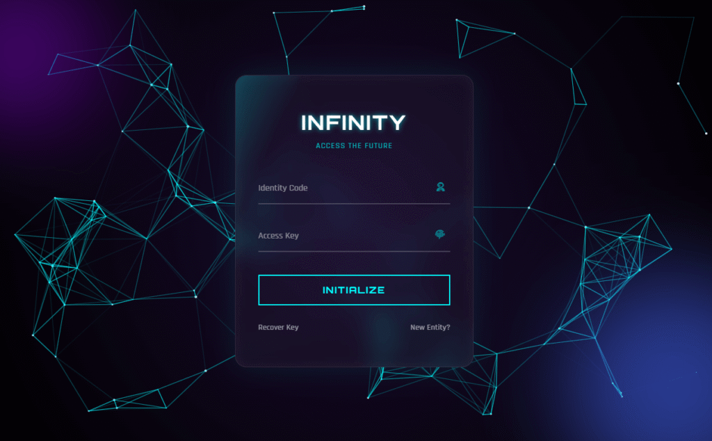
- Glassmorphism Login Form with Particle Background — canvas particle constellation, 3D tilt, and glassmorphism combined
Need a custom UI built?
I Build Cyberpunk & Futuristic Web Interfaces
Dark landing pages, gaming site UIs, interactive portfolio designs, or any bespoke CSS/JS effect — I design and code from scratch, no templates. Starting at $10 on Fiverr.