Default browser buttons are invisible. They blend into the page, get ignored, and cost you clicks. A CSS neon button with a glowing hover effect does the opposite — it pulls the eye, signals interactivity, and makes your UI feel premium.
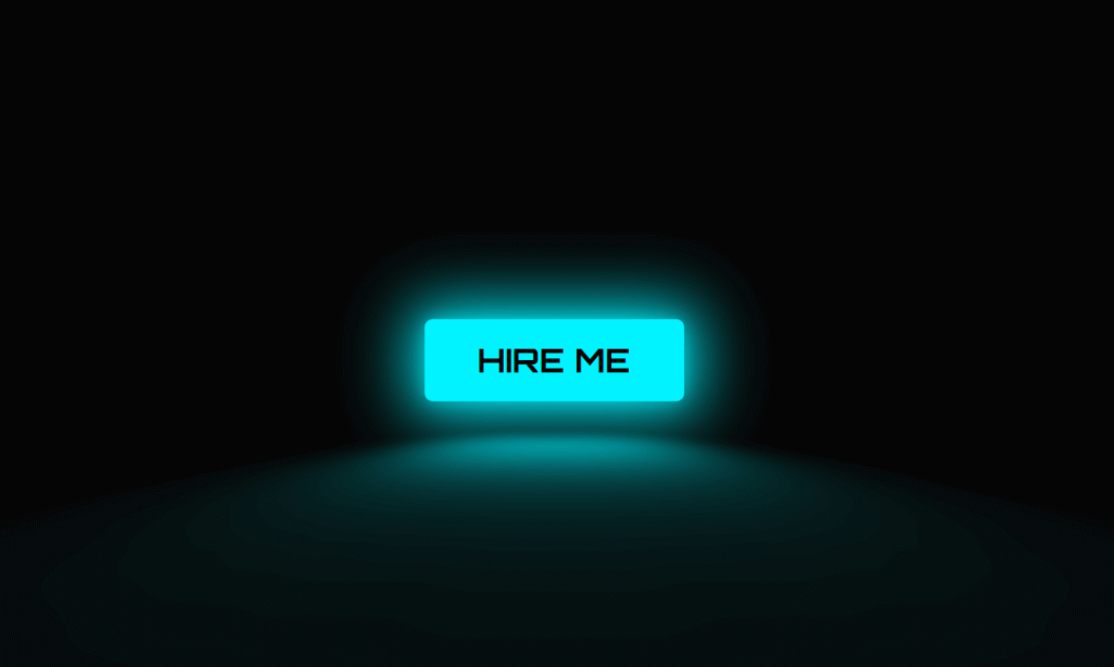
In this tutorial you will build a fully working pure CSS neon button from scratch. No JavaScript. No libraries. The final result includes a pulsing border glow, a neon floor reflection using a CSS perspective transform, and a full colour-fill on hover — all running at 60fps on any device.
By the end you will also have four ready-to-use colour variants — cyan, pink, green, and orange — that you can drop into any project immediately.
What the Neon Button Does
Before writing any code it helps to understand what each visual layer is actually doing:
- Border glow — A layered
box-shadowwith multiple radii creates the neon tube effect. An inner shadow adds depth, an outer shadow creates the spread of light into the surrounding dark background. - Text glow —
text-shadowwith a low-opacity colour matches the border, making the label look lit from within. - Floor reflection — A
::beforepseudo-element positioned below the button, stretched withperspectiveandrotateX, and blurred withfilter: blur()simulates neon light pooling on a surface underneath. - Hover fill — The
::afterpseudo-element fills the button with the neon colour on hover, and the text switches to dark for contrast. - Transition performance — Only
opacity,background-color, andcolorare animated. These are GPU-composited properties, so the effect runs at 60fps without triggering layout recalculation.
Step 1 — The HTML
The HTML is a single <a> tag. Keep the button text short — one to three words. Longer text breaks the sizing and the glow proportions.
<!-- Place this wherever you want the button -->
<a href="#" class="neon-button">HIRE ME</a>

<!-- Multiple buttons: add a modifier class for each colour -->
<a href="#" class="neon-button neon-cyan">CYAN</a>
<a href="#" class="neon-button neon-pink">PINK</a>
<a href="#" class="neon-button neon-green">GREEN</a>
<a href="#" class="neon-button neon-orange">ORANGE</a>
Step 2 — The Base CSS (Single Button)
Start with the single cyan version to understand each property before adding the colour variants.
/* ── Google Font: sci-fi monospace style ── */
@import url('https://fonts.googleapis.com/css2?family=Orbitron:wght@700&display=swap');

/* ── Page background ── */
body {
    background: #050505;
    display: flex;
    justify-content: center;
    align-items: center;
    min-height: 100vh;
    margin: 0;
}

/* ── Core button styles ── */
.neon-button {
    font-family: 'Orbitron', sans-serif;
    font-size: 1.5rem;
    display: inline-block;
    padding: 0.55em 1.6em;
    color: #00f3ff;              /* neon cyan text */
    border: 3px solid #00f3ff;
    border-radius: 0.25em;
    text-decoration: none;
    letter-spacing: 0.12em;
    position: relative;

    /* Text glow */
    text-shadow:
        0 0 0.4em rgba(0, 243, 255, 0.6),
        0 0 1em rgba(0, 243, 255, 0.3);

    /* Border glow: inner + outer layers */
    box-shadow:
        inset 0 0 0.6em rgba(0, 243, 255, 0.4),
        0 0 0.6em rgba(0, 243, 255, 0.4),
        0 0 2em rgba(0, 243, 255, 0.2);

    transition: background-color 0.2s, color 0.2s;
    cursor: pointer;
}

/* ── Floor reflection ──
   A blurred, perspective-flattened copy of the button's glow
   placed just below it to simulate neon light on a surface.     */
.neon-button::before {
    content: '';
    position: absolute;
    top: 120%;           /* positioned below the button */
    left: 0;
    width: 100%;
    height: 100%;
    background: #00f3ff;

    /* Flatten it into a floor plane */
    transform: perspective(1em) rotateX(40deg) scale(1, 0.35);
    filter: blur(1.5em);
    opacity: 0.4;
    pointer-events: none;
    transition: opacity 0.2s;
}

/* ── Hover fill background ──
   Sits behind the text (z-index: -1) and fades in on hover.     */
.neon-button::after {
    content: '';
    position: absolute;
    inset: 0;            /* shorthand for top/right/bottom/left: 0 */
    background: #00f3ff;
    box-shadow: 0 0 2em 0.5em rgba(0, 243, 255, 0.4);
    opacity: 0;
    z-index: -1;
    transition: opacity 0.2s;
}

/* ── Hover state ── */
.neon-button:hover {
    color: #050505;      /* dark text over the neon fill */
    text-shadow: none;
}

.neon-button:hover::before { opacity: 0.9; }  /* reflection brightens */
.neon-button:hover::after  { opacity: 1; }    /* fill fades in */
How the Layered box-shadow Creates the Neon Effect
The neon glow is not a single box-shadow — it is three layers stacked in one declaration, separated by commas. Each layer serves a specific purpose:
inset 0 0 0.6em rgba(0,243,255,0.4)— An inner shadow that lights the inside face of the button border, making it look like glass filled with coloured gas.0 0 0.6em rgba(0,243,255,0.4)— A tight outer shadow that creates the primary glow halo around the border.0 0 2em rgba(0,243,255,0.2)— A wide, low-opacity outer shadow that spreads the light softly into the background, simulating how neon light behaves in real life.
The key is using rgba with low alpha values on the outer shadows rather than solid colours. This is what separates a realistic neon look from a harsh, flat outline.
Step 3 — Four Colour Variants (Copy-Paste Ready)
The base button uses CSS custom properties at the element level so each variant only needs to override three values: the colour, border, and glow. All other styles — sizing, font, transition, pseudo-elements — are inherited from the base .neon-button class.
/* ────────────────────────────
   VARIANT 1: Cyan (default)
──────────────────────────── */
.neon-cyan,
.neon-button {
    --neon: #00f3ff;
    color: var(--neon);
    border-color: var(--neon);
    text-shadow: 0 0 0.4em rgba(0, 243, 255, 0.6);
    box-shadow:
        inset 0 0 0.6em rgba(0, 243, 255, 0.4),
        0 0 0.6em rgba(0, 243, 255, 0.4),
        0 0 2em rgba(0, 243, 255, 0.2);
}
.neon-cyan::before, .neon-button::before { background: #00f3ff; }
.neon-cyan::after,  .neon-button::after  {
    background: #00f3ff;
    box-shadow: 0 0 2em 0.5em rgba(0, 243, 255, 0.4);
}

/* ────────────────────────────
   VARIANT 2: Pink / Hot
──────────────────────────── */
.neon-pink {
    color: #ff0055;
    border-color: #ff0055;
    text-shadow: 0 0 0.4em rgba(255, 0, 85, 0.6);
    box-shadow:
        inset 0 0 0.6em rgba(255, 0, 85, 0.4),
        0 0 0.6em rgba(255, 0, 85, 0.4),
        0 0 2em rgba(255, 0, 85, 0.2);
}
.neon-pink::before { background: #ff0055; }
.neon-pink::after  {
    background: #ff0055;
    box-shadow: 0 0 2em 0.5em rgba(255, 0, 85, 0.4);
}
.neon-pink:hover { color: #fff; }

/* ────────────────────────────
   VARIANT 3: Green / Matrix
──────────────────────────── */
.neon-green {
    color: #39ff14;
    border-color: #39ff14;
    text-shadow: 0 0 0.4em rgba(57, 255, 20, 0.6);
    box-shadow:
        inset 0 0 0.6em rgba(57, 255, 20, 0.4),
        0 0 0.6em rgba(57, 255, 20, 0.4),
        0 0 2em rgba(57, 255, 20, 0.2);
}
.neon-green::before { background: #39ff14; }
.neon-green::after  {
    background: #39ff14;
    box-shadow: 0 0 2em 0.5em rgba(57, 255, 20, 0.4);
}
.neon-green:hover { color: #050505; }

/* ────────────────────────────
   VARIANT 4: Orange / Warning
──────────────────────────── */
.neon-orange {
    color: #ff6600;
    border-color: #ff6600;
    text-shadow: 0 0 0.4em rgba(255, 102, 0, 0.6);
    box-shadow:
        inset 0 0 0.6em rgba(255, 102, 0, 0.4),
        0 0 0.6em rgba(255, 102, 0, 0.4),
        0 0 2em rgba(255, 102, 0, 0.2);
}
.neon-orange::before { background: #ff6600; }
.neon-orange::after  {
    background: #ff6600;
    box-shadow: 0 0 2em 0.5em rgba(255, 102, 0, 0.4);
}
.neon-orange:hover { color: #050505; }
Bonus: Adding a Pulse Animation
For a CTA button you want visitors to notice immediately, add a continuous pulse to the glow. This uses a CSS @keyframes animation that oscillates the box-shadow opacity between a dim and bright state.
/* Add this class to any neon-button variant */
.neon-pulse {
    animation: neon-pulse 2s ease-in-out infinite;
}

@keyframes neon-pulse {
    0%, 100% {
        box-shadow:
            inset 0 0 0.6em rgba(0, 243, 255, 0.4),
            0 0 0.6em rgba(0, 243, 255, 0.4),
            0 0 2em rgba(0, 243, 255, 0.2);
    }
    50% {
        box-shadow:
            inset 0 0 0.8em rgba(0, 243, 255, 0.7),
            0 0 1.2em rgba(0, 243, 255, 0.7),
            0 0 3em rgba(0, 243, 255, 0.4);
    }
}

/* Usage example: */
/* <a href="#" class="neon-button neon-pulse">GET STARTED</a> */
Performance note: Animating box-shadow triggers the paint step on each frame. For most buttons this is imperceptible. If you have many pulsing elements on the same page, consider using filter: drop-shadow() instead — it runs on the compositing layer and does not trigger paint.
How to Customise the Neon Button
- Change colour: Replace the
#00f3ffhex value and itsrgba()equivalents with your brand colour. The rgba values are just the hex broken into red, green, blue components. - Change font: Swap
'Orbitron'for any Google Font. For non-cyberpunk designs try'Space Mono','Courier Prime', or your site’s existing font stack. - Remove the reflection: Delete the entire
.neon-button::beforeblock if your button sits on a light background where a glow puddle wouldn’t make sense. - Adjust glow intensity: Increase the
emvalues inbox-shadowfor a more aggressive glow or decrease them for a subtler effect. - Use on a light background: Swap the background from
#050505to white, change the button colour to a dark neon (deep violet#7c00ffor dark teal#005f73), and the neon effect still reads clearly.
Where to Use a CSS Neon Button
The neon button style works best in specific contexts. Using it everywhere weakens the effect — it should be reserved for the one action you most want users to take:
- Dark-mode portfolio sites — A single cyan “Hire Me” or “View Work” CTA on a dark background is the highest-contrast element on the page. Eyes go there first.
- Game and app landing pages — “Download”, “Play Now”, and “Get Early Access” buttons in neon green or orange feel native to gaming and tech aesthetics.
- Agency and freelancer sites — A pulsing “Get a Quote” button in a dark hero section consistently outperforms flat colour buttons because the animation creates urgency without being intrusive.
- SaaS pricing pages — Use the highlight colour on the recommended plan’s CTA only. A single glowing button surrounded by plain ones draws the click.
Complete Code (Copy and Paste)
Here is the full working page including the page setup, base button, and all four colour variants in one file:
<!DOCTYPE html>
<html lang="en">
<head>
    <meta charset="UTF-8">
    <meta name="viewport" content="width=device-width, initial-scale=1.0">
    <title>CSS Neon Button</title>
    <style>
    @import url('https://fonts.googleapis.com/css2?family=Orbitron:wght@700&display=swap');

    *, *::before, *::after { box-sizing: border-box; }

    body {
        background: #050505;
        display: flex;
        flex-direction: column;
        justify-content: center;
        align-items: center;
        gap: 3rem;
        min-height: 100vh;
        margin: 0;
    }

    .neon-button {
        font-family: 'Orbitron', sans-serif;
        font-size: 1.5rem;
        display: inline-block;
        padding: 0.55em 1.6em;
        border: 3px solid;
        border-radius: 0.25em;
        text-decoration: none;
        letter-spacing: 0.12em;
        position: relative;
        transition: background-color 0.2s, color 0.2s;
        cursor: pointer;
        isolation: isolate;
    }

    .neon-button::before {
        content: '';
        position: absolute;
        top: 120%; left: 0;
        width: 100%; height: 100%;
        transform: perspective(1em) rotateX(40deg) scale(1, 0.35);
        filter: blur(1.5em);
        opacity: 0.4;
        pointer-events: none;
        transition: opacity 0.2s;
    }

    .neon-button::after {
        content: '';
        position: absolute;
        inset: 0;
        opacity: 0;
        z-index: -1;
        transition: opacity 0.2s;
    }

    .neon-button:hover::before { opacity: 0.9; }
    .neon-button:hover::after  { opacity: 1; }
    .neon-button:hover          { text-shadow: none; }

    /* Cyan */
    .neon-cyan {
        color: #00f3ff; border-color: #00f3ff;
        text-shadow: 0 0 0.4em rgba(0,243,255,.6);
        box-shadow: inset 0 0 .6em rgba(0,243,255,.4), 0 0 .6em rgba(0,243,255,.4), 0 0 2em rgba(0,243,255,.2);
    }
    .neon-cyan::before, .neon-cyan::after { background: #00f3ff; }
    .neon-cyan:hover { color: #050505; }

    /* Pink */
    .neon-pink {
        color: #ff0055; border-color: #ff0055;
        text-shadow: 0 0 0.4em rgba(255,0,85,.6);
        box-shadow: inset 0 0 .6em rgba(255,0,85,.4), 0 0 .6em rgba(255,0,85,.4), 0 0 2em rgba(255,0,85,.2);
    }
    .neon-pink::before, .neon-pink::after { background: #ff0055; }
    .neon-pink:hover { color: #fff; }

    /* Green */
    .neon-green {
        color: #39ff14; border-color: #39ff14;
        text-shadow: 0 0 0.4em rgba(57,255,20,.6);
        box-shadow: inset 0 0 .6em rgba(57,255,20,.4), 0 0 .6em rgba(57,255,20,.4), 0 0 2em rgba(57,255,20,.2);
    }
    .neon-green::before, .neon-green::after { background: #39ff14; }
    .neon-green:hover { color: #050505; }

    /* Orange */
    .neon-orange {
        color: #ff6600; border-color: #ff6600;
        text-shadow: 0 0 0.4em rgba(255,102,0,.6);
        box-shadow: inset 0 0 .6em rgba(255,102,0,.4), 0 0 .6em rgba(255,102,0,.4), 0 0 2em rgba(255,102,0,.2);
    }
    .neon-orange::before, .neon-orange::after { background: #ff6600; }
    .neon-orange:hover { color: #050505; }

    /* Pulse animation */
    .neon-pulse { animation: pulse 2s ease-in-out infinite; }
    @keyframes pulse {
        0%,100% { box-shadow: inset 0 0 .6em rgba(0,243,255,.4), 0 0 .6em rgba(0,243,255,.4), 0 0 2em rgba(0,243,255,.2); }
        50%      { box-shadow: inset 0 0 .8em rgba(0,243,255,.7), 0 0 1.2em rgba(0,243,255,.7), 0 0 3em rgba(0,243,255,.4); }
    }
    </style>
</head>
<body>
    <a href="#" class="neon-button neon-cyan neon-pulse">HIRE ME</a>
    <a href="#" class="neon-button neon-pink">CONTACT</a>
    <a href="#" class="neon-button neon-green">DOWNLOAD</a>
    <a href="#" class="neon-button neon-orange">BUY NOW</a>
</body>
</html>
Want this done for you?
Need a Custom UI Component or a Complete Website?
I build custom CSS animations, neon UI components, and high-performance WordPress websites for agencies and freelancers. If you need something like this built professionally — or want your whole site redesigned — I can help.
More CSS Effects You Might Like
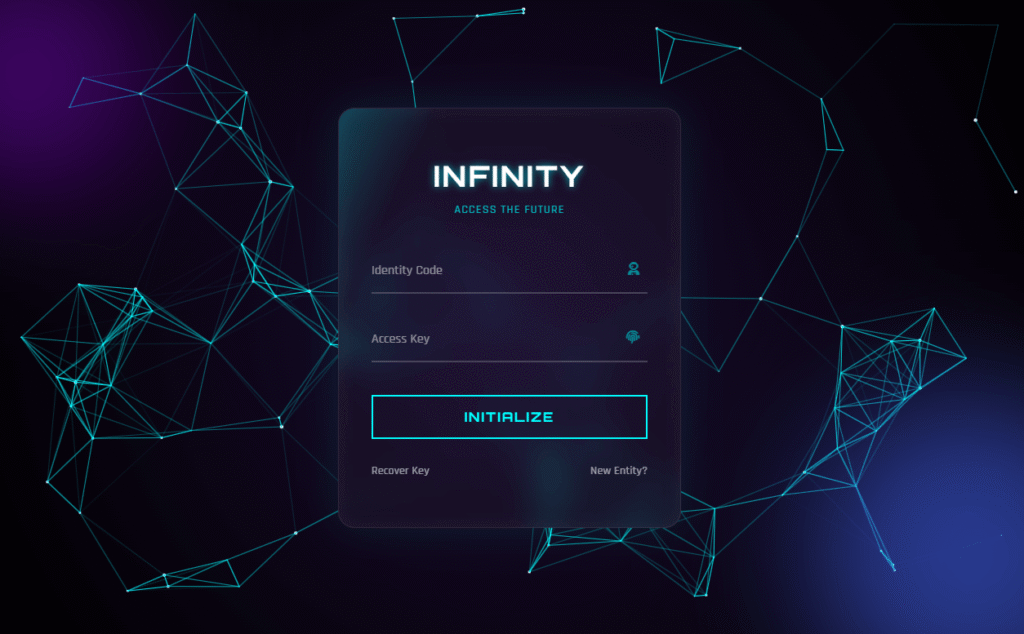
- Cyberpunk Glitch Card CSS — 3D Tilt + Glitch Text Effect — Use this button inside the card for a complete cyberpunk UI.
- Mastering the CSS Glitch Effect — Line-by-Line Breakdown — How the
clip+@keyframesglitch technique works in detail. - Futuristic Login Form HTML CSS — A full sci-fi login interface using similar neon glow techniques.
Conclusion
The CSS neon button is one of those effects that looks complex but is built from a handful of properties you already know: box-shadow, text-shadow, filter, perspective, and CSS transitions. Once you understand how the layers stack, you can apply the same technique to any element — cards, inputs, navigation links, or borders.
Grab the full code from CodePen, pick the colour that matches your project, and drop it in. If the pulse animation is too aggressive for your use case, just remove the neon-pulse class.
Happy coding 👾

Comments are closed.