
This post gives you a complete, fully responsive newspaper website template built with pure HTML and CSS — no Bootstrap, no frameworks, no paid subscriptions. Download the source code, open it in your browser, and you have a working news portal homepage in under a minute.
There are two complete CSS versions included, both using the same single HTML file. Swap one stylesheet for the other and the entire visual identity of the site transforms — same structure, completely different design.
▶ Live Demo
See both versions running in CodePen
What’s Included
Both versions share one HTML file and one JavaScript file. The only thing that changes is which CSS file you link. Here is everything in the package:
| File | Purpose |
|---|---|
| index.html | Shared structure — works with both CSS files |
| style.css | Version 1 — Classic broadsheet (Merriweather, compact layout) |
| style-modern.css | Version 2 — Modern magazine (Playfair Display, spacious layout) |
| script.js | Mobile menu toggle + auto date display |
Key Features
- Fully responsive: 4-column desktop layout collapses cleanly to a single column on mobile. No horizontal scrolling on any screen size.
- Pure CSS Grid + Flexbox: No Bootstrap, no Tailwind, no external CSS frameworks. The stylesheet is entirely self-contained and loads instantly.
- Breaking news ticker: Animated scrolling headline bar built with a CSS
@keyframesanimation — no JavaScript required for the ticker itself. - Sticky navigation: The header stays at the top of the viewport on scroll, with a shadow that appears only on scroll to keep the page feeling clean when at the top.
- Mobile hamburger menu: A single JavaScript function toggles the nav open and closed on small screens with a smooth CSS slide-down animation.
- Auto date: A small JS snippet reads the system date and writes it into the top bar — always current, never stale.
- Hero section with gradient overlays: Text sits over images using CSS
linear-gradientoverlays — readable on any image without needing to pick a specific colour. - Dark tech section: An embedded dark-background section inside the main content area creates visual hierarchy without a separate page.
- Sidebar widgets: Trending list, newsletter signup, and opinion cards — all pure HTML and CSS, ready to be wired to a backend.
- Unsplash images: All placeholder images come from Unsplash via direct URL — no local image files needed to run the demo.
Version 1 vs Version 2 — At a Glance
| Feature | Version 1 — Classic | Version 2 — Modern |
|---|---|---|
| Heading Font | Merriweather (serif) | Playfair Display (luxury serif) |
| Card Style | Compact, tight spacing | Spacious, breathing room |
| Nav Hover Effect | Bottom border fills with red | Animated underline slides in |
| Sports Cards | Text overlay directly on image | White pill card over image |
| Card Hover | Lift + shadow | Lift + deeper shadow |
| Best For | News portals, government sites, archives | Lifestyle blogs, tech magazines, editorials |
The Concept: 2 Designs, 1 HTML File
The core idea behind this template is a practical demonstration of CSS architecture: the HTML is the structure, the CSS is the design. Every element on the page — the hero, the grid, the ticker, the sidebar — is described in semantic HTML once. The two stylesheets then interpret that structure in completely different ways.
This means if you ever want to refresh the look of a news site without rebuilding it, you only need to rewrite the CSS. The content, the DOM structure, and all the JavaScript stay exactly the same. It is the same principle that makes CSS themes work in WordPress — and building this from scratch gives you a much deeper understanding of how to design with that pattern intentionally.
Get the Source Code
Create a folder on your computer, then create the three files below. The full CSS for both versions follows after the HTML and JavaScript.
1. index.html — The Structure (Works for Both Versions)
<!DOCTYPE html>
<html lang="en">
<head>
    <meta charset="UTF-8">
    <meta name="viewport" content="width=device-width, initial-scale=1.0">
    <title>The Daily Chronicle | Global News Portal</title>
    <link href="https://cdnjs.cloudflare.com/ajax/libs/font-awesome/6.4.0/css/all.min.css" rel="stylesheet">
    <link href="https://fonts.googleapis.com/css2?family=Merriweather:wght@300;400;700;900&family=Roboto:wght@300;400;500;700&display=swap" rel="stylesheet">
    <link rel="stylesheet" href="style.css">
</head>
<body>

    <div class="top-bar">
        <div class="container top-bar-inner">
            <div id="current-date"></div>
            <div class="social-links">
                <a href="#"><i class="fab fa-facebook-f"></i></a>
                <a href="#"><i class="fab fa-twitter"></i></a>
                <a href="#"><i class="fab fa-instagram"></i></a>
                <a href="#"><i class="fab fa-youtube"></i></a>
            </div>
        </div>
    </div>

    <header>
        <div class="container header-inner">
            <div class="menu-icon" onclick="toggleMenu()"><i class="fas fa-bars"></i></div>
            <div class="logo">The Daily Chronicle</div>
            <div class="search-icon"><i class="fas fa-search"></i></div>
        </div>
        <nav id="navbar">
            <ul class="container">
                <li><a href="#" class="active">Home</a></li>
                <li><a href="#">World</a></li>
                <li><a href="#">Politics</a></li>
                <li><a href="#">Business</a></li>
                <li><a href="#">Technology</a></li>
                <li><a href="#">Health</a></li>
                <li><a href="#">Sports</a></li>
                <li><a href="#">Entertainment</a></li>
                <li><a href="#">Opinion</a></li>
            </ul>
        </nav>
    </header>

    <div class="ticker-wrap">
        <div class="ticker-heading">BREAKING</div>
        <div class="ticker">
            <div class="ticker-item">Global markets reach all-time high amidst tech boom.</div>
            <div class="ticker-item">New climate policy signed by 50 nations in Geneva.</div>
            <div class="ticker-item">SpaceX announces next mission to Mars for 2028.</div>
        </div>
    </div>

    <main class="container">
        <section class="hero-section">
            <div class="hero-main">
                <div class="img-overlay">
                    <img src="https://images.unsplash.com/photo-1529101091760-61df6be24296?q=80&w=1000" alt="Main News">
                </div>
                <div class="hero-text">
                    <span class="category-tag red">Politics</span>
                    <h1>Historic Summit Ends with Major Agreements on Global Trade</h1>
                    <p>Leaders from around the world gathered today to finalize the deal that has been in negotiation for over a decade.</p>
                </div>
            </div>
            <div class="hero-sub">
                <article class="sub-card">
                    <img src="https://images.unsplash.com/photo-1550751827-4bd374c3f58b?q=80&w=500" alt="Sub 1">
                    <div class="sub-text">
                        <span class="category-tag blue">Tech</span>
                        <h3>Cybersecurity Threats on the Rise</h3>
                    </div>
                </article>
                <article class="sub-card">
                    <img src="https://images.unsplash.com/photo-1461896836934-ffe607ba8211?q=80&w=500" alt="Sub 2">
                    <div class="sub-text">
                        <span class="category-tag green">Sports</span>
                        <h3>Championship Finals: What to Expect</h3>
                    </div>
                </article>
            </div>
        </section>

        <div class="content-wrapper">
            <div class="main-column">

                <section class="category-section">
                    <div class="section-header">
                        <h2>Latest News</h2>
                        <span class="line"></span>
                    </div>
                    <div class="news-grid">
                        <article class="news-card">
                            <img src="https://images.unsplash.com/photo-1504711434969-e33886168f5c?q=80&w=400" alt="News">
                            <div class="news-body">
                                <span class="cat-text">World</span>
                                <h3>UN Declares New Education Initiative</h3>
                                <p>Aims to provide digital access to remote areas.</p>
                                <span class="time">2 hours ago</span>
                            </div>
                        </article>
                        <article class="news-card">
                            <img src="https://images.unsplash.com/photo-1576091160399-112ba8d25d1d?q=80&w=400" alt="News">
                            <div class="news-body">
                                <span class="cat-text">Health</span>
                                <h3>Breakthrough in Medical Research</h3>
                                <p>Scientists discover potential cure for rare disease.</p>
                                <span class="time">4 hours ago</span>
                            </div>
                        </article>
                        <article class="news-card">
                            <img src="https://images.unsplash.com/photo-1486312338219-ce68d2c6f44d?q=80&w=400" alt="News">
                            <div class="news-body">
                                <span class="cat-text">Lifestyle</span>
                                <h3>The Rise of Remote Work Culture</h3>
                                <p>How digital nomadism is reshaping cities.</p>
                                <span class="time">5 hours ago</span>
                            </div>
                        </article>
                    </div>
                </section>

                <section class="tech-section">
                    <div class="section-header dark-header">
                        <h2>Technology & Future</h2>
                        <a href="#">View All</a>
                    </div>
                    <div class="tech-grid">
                        <div class="tech-main">
                            <img src="https://images.unsplash.com/photo-1518770660439-4636190af475?q=80&w=600" alt="Tech">
                            <div class="tech-overlay">
                                <h3>AI Revolution: Friend or Foe?</h3>
                            </div>
                        </div>
                        <div class="tech-list">
                            <div class="tech-item">
                                <img src="https://images.unsplash.com/photo-1550009158-9ebf69173e03?q=80&w=150" alt="T1">
                                <div>
                                    <h4>New VR Headsets Launching Soon</h4>
                                    <span>Gadgets</span>
                                </div>
                            </div>
                            <div class="tech-item">
                                <img src="https://images.unsplash.com/photo-1519389950473-47ba0277781c?q=80&w=150" alt="T2">
                                <div>
                                    <h4>Coding for Kids: A New Curriculum</h4>
                                    <span>Education</span>
                                </div>
                            </div>
                            <div class="tech-item">
                                <img src="https://images.unsplash.com/photo-1563770095-11a13e2a6906?q=80&w=150" alt="T3">
                                <div>
                                    <h4>Electric Vehicles Sales Spike</h4>
                                    <span>Auto</span>
                                </div>
                            </div>
                        </div>
                    </div>
                </section>

                <section class="category-section">
                    <div class="section-header">
                        <h2>Sports Highlights</h2>
                        <span class="line"></span>
                    </div>
                    <div class="sports-layout">
                        <article class="sports-card">
                            <img src="https://images.unsplash.com/photo-1579952363873-27f3bde9be2e?q=80&w=500" alt="Sports">
                            <h3>Premier League Update</h3>
                        </article>
                        <article class="sports-card">
                            <img src="https://images.unsplash.com/photo-1541534741688-6078c6bfb5c5?q=80&w=500" alt="Sports">
                            <h3>Olympic Preparations Begin</h3>
                        </article>
                        <article class="sports-card">
                            <img src="https://images.unsplash.com/photo-1628779238951-be2c9f256544?q=80&w=500" alt="Sports">
                            <h3>Cricket World Cup Analysis</h3>
                        </article>
                    </div>
                </section>

            </div>

            <aside class="sidebar">
                <div class="widget">
                    <h3 class="widget-title">Trending Now</h3>
                    <ul class="trending-list">
                        <li><span class="number">1</span><a href="#">Stock markets crash amidst uncertainty</a></li>
                        <li><span class="number">2</span><a href="#">New galaxy discovered by James Webb</a></li>
                        <li><span class="number">3</span><a href="#">Best travel destinations for 2025</a></li>
                        <li><span class="number">4</span><a href="#">Local elections results announced</a></li>
                        <li><span class="number">5</span><a href="#">Celebrity gala raises millions</a></li>
                    </ul>
                </div>
                <div class="widget ad-widget"><span>Advertisement</span></div>
                <div class="widget newsletter-widget">
                    <h3 class="widget-title">Subscribe</h3>
                    <p>Get the latest news delivered to your inbox daily.</p>
                    <input type="email" placeholder="Your email address">
                    <button>Subscribe</button>
                </div>
                <div class="widget">
                    <h3 class="widget-title">Opinion</h3>
                    <div class="opinion-item">
                        <img src="https://images.unsplash.com/photo-1534528741775-53994a69daeb?q=80&w=100" alt="Author">
                        <div><h4>The Climate Crisis</h4><span class="author">By Sarah Jenkins</span></div>
                    </div>
                    <div class="opinion-item">
                        <img src="https://images.unsplash.com/photo-1507003211169-0a1dd7228f2d?q=80&w=100" alt="Author">
                        <div><h4>Economic Reform</h4><span class="author">By David Smith</span></div>
                    </div>
                </div>
            </aside>
        </div>
    </main>

    <footer>
        <div class="container footer-content">
            <div class="footer-col">
                <div class="footer-logo">The Daily Chronicle</div>
                <p>Delivering truth and perspective on the world's most important stories since 1990.</p>
            </div>
            <div class="footer-col">
                <h4>Sections</h4>
                <ul><li><a href="#">World</a></li><li><a href="#">Politics</a></li><li><a href="#">Tech</a></li><li><a href="#">Sports</a></li></ul>
            </div>
            <div class="footer-col">
                <h4>About Us</h4>
                <ul><li><a href="#">Contact</a></li><li><a href="#">Careers</a></li><li><a href="#">Privacy Policy</a></li><li><a href="#">Terms of Service</a></li></ul>
            </div>
            <div class="footer-col">
                <h4>Follow Us</h4>
                <div class="social-links">
                    <a href="#"><i class="fab fa-facebook-f"></i></a>
                    <a href="#"><i class="fab fa-twitter"></i></a>
                    <a href="#"><i class="fab fa-youtube"></i></a>
                </div>
            </div>
        </div>
        <div class="copyright">© 2025 The Daily Chronicle. All Rights Reserved.</div>
    </footer>

    <script src="script.js"></script>
</body>
</html>
How to Switch Between Versions
It is one line change in the <head> of index.html:
<!-- Version 1: Classic -->
<link rel="stylesheet" href="style.css">

<!-- Version 2: Modern (swap to this) -->
<link rel="stylesheet" href="style-modern.css">
2. style.css — Version 1: Classic Broadsheet
Best for hard news portals, government information sites, academic publications, or any project where density and trustworthiness matter more than visual flair.
/* --- 1. VARIABLES & RESET --- */
:root {
    --primary-color: #111111;
    --accent-color: #d93025;
    --accent-blue: #1a73e8;
    --accent-green: #188038;
    --bg-body: #f8f9fa;
    --bg-white: #ffffff;
    --bg-dark: #1f2023;
    --text-main: #202124;
    --text-muted: #5f6368;
    --border-color: #dadce0;
    --font-serif: 'Merriweather', serif;
    --font-sans: 'Roboto', sans-serif;
    --shadow-sm: 0 1px 3px rgba(0,0,0,0.12), 0 1px 2px rgba(0,0,0,0.24);
    --shadow-md: 0 4px 6px rgba(0,0,0,0.1);
    --shadow-hover: 0 10px 20px rgba(0,0,0,0.15);
    --radius: 8px;
}
* { margin: 0; padding: 0; box-sizing: border-box; }
body { font-family: var(--font-sans); background-color: var(--bg-body); color: var(--text-main); line-height: 1.6; -webkit-font-smoothing: antialiased; }
a { text-decoration: none; color: inherit; transition: all 0.3s ease; }
img { width: 100%; height: 100%; object-fit: cover; display: block; transition: transform 0.5s ease; }
ul { list-style: none; }
.container { max-width: 1240px; margin: 0 auto; padding: 0 20px; }

/* --- 2. TOP BAR & HEADER --- */
.top-bar { background-color: var(--primary-color); color: #fff; font-size: 0.85rem; padding: 8px 0; }
.top-bar-inner { display: flex; justify-content: space-between; align-items: center; }
.social-links a { margin-left: 20px; color: #aaa; font-size: 0.9rem; }
.social-links a:hover { color: var(--bg-white); }
header { background: var(--bg-white); border-bottom: 1px solid var(--border-color); padding: 25px 0 0; position: sticky; top: 0; z-index: 1000; box-shadow: 0 2px 10px rgba(0,0,0,0.05); }
.header-inner { display: flex; justify-content: space-between; align-items: center; padding-bottom: 20px; }
.logo { font-family: var(--font-serif); font-size: 2.8rem; font-weight: 900; color: var(--primary-color); letter-spacing: -1.5px; text-transform: uppercase; background: linear-gradient(45deg, #111, #444); -webkit-background-clip: text; -webkit-text-fill-color: transparent; }
.menu-icon, .search-icon { font-size: 1.4rem; color: var(--text-main); cursor: pointer; display: none; }

/* --- 3. NAVIGATION --- */
nav { border-top: 1px solid var(--border-color); }
nav ul { display: flex; justify-content: center; flex-wrap: wrap; }
nav ul a { display: block; padding: 15px 20px; font-weight: 700; font-size: 0.85rem; text-transform: uppercase; color: var(--text-main); letter-spacing: 0.5px; border-bottom: 3px solid transparent; }
nav ul a:hover, nav ul a.active { color: var(--accent-color); border-bottom-color: var(--accent-color); background-color: rgba(217, 48, 37, 0.05); }

/* --- 4. NEWS TICKER --- */
.ticker-wrap { background: var(--primary-color); color: #fff; display: flex; height: 45px; overflow: hidden; font-family: var(--font-sans); }
.ticker-heading { background: var(--accent-color); padding: 0 20px; display: flex; align-items: center; font-weight: 800; font-size: 0.8rem; text-transform: uppercase; letter-spacing: 1px; z-index: 10; box-shadow: 5px 0 10px rgba(0,0,0,0.2); }
.ticker { display: flex; align-items: center; animation: ticker 35s linear infinite; white-space: nowrap; }
.ticker-item { padding: 0 40px; font-size: 0.95rem; position: relative; }
.ticker-item::after { content: '•'; position: absolute; right: 0; color: var(--accent-color); }
@keyframes ticker { 0% { transform: translateX(0); } 100% { transform: translateX(-100%); } }

/* --- 5. HERO SECTION --- */
.hero-section { display: grid; grid-template-columns: 2.2fr 1fr; gap: 20px; margin-top: 30px; height: 500px; }
.hero-main, .sub-card { position: relative; border-radius: var(--radius); overflow: hidden; cursor: pointer; box-shadow: var(--shadow-sm); }
.hero-main:hover img, .sub-card:hover img { transform: scale(1.05); }
.img-overlay, .hero-main img, .sub-card img { width: 100%; height: 100%; }
.hero-text, .sub-text { position: absolute; bottom: 0; left: 0; width: 100%; padding: 30px; background: linear-gradient(to top, rgba(0,0,0,0.9) 0%, rgba(0,0,0,0.5) 60%, transparent 100%); color: #fff; z-index: 2; }
.hero-text h1 { font-family: var(--font-serif); font-size: 2.4rem; margin: 10px 0; line-height: 1.2; text-shadow: 0 2px 4px rgba(0,0,0,0.5); }
.hero-text p { font-size: 1.1rem; opacity: 0.9; display: -webkit-box; -webkit-line-clamp: 2; -webkit-box-orient: vertical; overflow: hidden; }
.hero-sub { display: grid; grid-template-rows: 1fr 1fr; gap: 20px; }
.sub-text { padding: 20px; }
.sub-text h3 { font-family: var(--font-serif); font-size: 1.3rem; margin-top: 5px; line-height: 1.3; }
.category-tag { padding: 4px 10px; font-size: 0.7rem; font-weight: 700; text-transform: uppercase; color: #fff; border-radius: 4px; display: inline-block; box-shadow: 0 2px 4px rgba(0,0,0,0.3); }
.red { background: var(--accent-color); }
.blue { background: var(--accent-blue); }
.green { background: var(--accent-green); }

/* --- 6. MAIN CONTENT AREA --- */
.content-wrapper { display: grid; grid-template-columns: 3fr 1fr; gap: 40px; margin: 60px 0; }
.section-header { display: flex; align-items: center; justify-content: space-between; margin-bottom: 25px; border-bottom: 2px solid var(--primary-color); padding-bottom: 10px; }
.section-header h2 { font-family: var(--font-serif); font-size: 1.6rem; color: var(--primary-color); }
.section-header a { font-size: 0.85rem; font-weight: 700; color: var(--accent-color); text-transform: uppercase; }
.news-grid { display: grid; grid-template-columns: repeat(3, 1fr); gap: 25px; }
.news-card { background: var(--bg-white); border-radius: var(--radius); overflow: hidden; box-shadow: var(--shadow-sm); transition: all 0.3s ease; border: 1px solid rgba(0,0,0,0.05); }
.news-card:hover { transform: translateY(-5px); box-shadow: var(--shadow-hover); }
.news-card img { height: 200px; width: 100%; }
.news-body { padding: 20px; }
.cat-text { color: var(--accent-color); font-size: 0.75rem; font-weight: 800; text-transform: uppercase; letter-spacing: 0.5px; }
.news-card h3 { font-family: var(--font-serif); font-size: 1.2rem; margin: 10px 0; line-height: 1.4; color: var(--primary-color); }
.news-card p { font-size: 0.9rem; color: var(--text-muted); margin-bottom: 15px; line-height: 1.5; }
.time { font-size: 0.75rem; color: #999; font-style: italic; display: block; text-align: right; }
.tech-section { background: var(--bg-dark); color: #fff; padding: 30px; border-radius: var(--radius); margin: 50px 0; box-shadow: var(--shadow-md); }
.dark-header { border-bottom-color: #444; }
.dark-header h2 { color: #fff; }
.tech-grid { display: grid; grid-template-columns: 1.5fr 1fr; gap: 25px; margin-top: 20px; }
.tech-main { position: relative; height: 320px; border-radius: var(--radius); overflow: hidden; }
.tech-overlay { position: absolute; bottom: 0; padding: 20px; background: linear-gradient(to top, rgba(0,0,0,0.9), transparent); width: 100%; }
.tech-overlay h3 { font-family: var(--font-serif); font-size: 1.5rem; }
.tech-list { display: flex; flex-direction: column; gap: 20px; }
.tech-item { display: flex; gap: 15px; align-items: center; background: rgba(255,255,255,0.05); padding: 10px; border-radius: var(--radius); transition: 0.3s; }
.tech-item:hover { background: rgba(255,255,255,0.1); }
.tech-item img { width: 90px; height: 70px; border-radius: 4px; }
.tech-item h4 { font-size: 1rem; margin-bottom: 5px; font-weight: 500; }
.tech-item span { font-size: 0.7rem; color: #aaa; text-transform: uppercase; letter-spacing: 1px; }
.sports-layout { display: grid; grid-template-columns: repeat(3, 1fr); gap: 20px; }
.sports-card { position: relative; height: 220px; border-radius: var(--radius); overflow: hidden; box-shadow: var(--shadow-sm); cursor: pointer; }
.sports-card:hover img { transform: scale(1.1); }
.sports-card h3 { position: absolute; bottom: 0; left: 0; right: 0; padding: 15px; background: linear-gradient(to top, #000 0%, transparent 100%); color: white; font-size: 1.1rem; font-weight: 700; }

/* --- 7. SIDEBAR --- */
.sidebar { padding-left: 30px; border-left: 1px solid var(--border-color); }
.widget { margin-bottom: 50px; }
.widget-title { font-family: var(--font-serif); font-size: 1.3rem; border-left: 4px solid var(--primary-color); padding-left: 15px; margin-bottom: 25px; font-weight: 800; }
.trending-list li { display: flex; align-items: baseline; margin-bottom: 20px; padding-bottom: 15px; border-bottom: 1px solid #eee; }
.trending-list li:last-child { border-bottom: none; }
.number { font-size: 2.5rem; color: #e0e0e0; font-weight: 900; margin-right: 20px; line-height: 0.8; font-style: italic; font-family: var(--font-serif); }
.trending-list a { font-size: 1.05rem; font-weight: 600; color: var(--text-main); line-height: 1.4; }
.trending-list a:hover { color: var(--accent-color); }
.newsletter-widget { background: #f1f3f4; padding: 25px; border-radius: var(--radius); text-align: center; }
.newsletter-widget p { font-size: 0.9rem; color: var(--text-muted); margin-bottom: 15px; }
.newsletter-widget input { width: 100%; padding: 12px; margin-bottom: 10px; border: 1px solid #ccc; border-radius: 4px; font-family: var(--font-sans); }
.newsletter-widget button { width: 100%; padding: 12px; background: var(--primary-color); color: #fff; border: none; border-radius: 4px; font-weight: 700; text-transform: uppercase; cursor: pointer; transition: 0.3s; }
.newsletter-widget button:hover { background: var(--accent-color); }
.opinion-item { display: flex; align-items: center; gap: 15px; margin-bottom: 20px; background: #fff; padding: 10px; border-radius: 50px 8px 8px 50px; box-shadow: var(--shadow-sm); border: 1px solid #eee; transition: 0.3s; }
.opinion-item:hover { box-shadow: var(--shadow-md); transform: translateX(5px); }
.opinion-item img { width: 50px; height: 50px; border-radius: 50%; }
.opinion-item h4 { font-size: 0.95rem; margin-bottom: 2px; font-weight: 700; }
.author { font-size: 0.75rem; color: var(--accent-color); font-weight: 600; text-transform: uppercase; }

/* --- 8. FOOTER --- */
footer { background: var(--bg-dark); color: #e8eaed; padding: 70px 0 30px; margin-top: 50px; }
.footer-content { display: grid; grid-template-columns: 2fr 1fr 1fr 1fr; gap: 50px; margin-bottom: 50px; }
.footer-logo { font-family: var(--font-serif); font-size: 1.8rem; font-weight: 900; color: #fff; margin-bottom: 20px; letter-spacing: -1px; }
.footer-col p { color: #9aa0a6; font-size: 0.9rem; line-height: 1.6; max-width: 300px; }
.footer-col h4 { color: #fff; margin-bottom: 20px; font-size: 0.85rem; font-weight: 700; text-transform: uppercase; letter-spacing: 1.5px; border-bottom: 2px solid var(--accent-color); display: inline-block; padding-bottom: 5px; }
.footer-col ul li { margin-bottom: 12px; }
.footer-col a { color: #bdc1c6; font-size: 0.9rem; }
.footer-col a:hover { color: #fff; padding-left: 5px; }
.copyright { text-align: center; border-top: 1px solid #3c4043; padding-top: 30px; font-size: 0.8rem; color: #9aa0a6; }

/* --- 9. RESPONSIVE --- */
@media (max-width: 1024px) {
    .hero-section { height: 400px; }
    .news-grid { grid-template-columns: repeat(2, 1fr); }
    nav ul a { padding: 15px 10px; font-size: 0.75rem; }
}
@media (max-width: 900px) {
    .content-wrapper { grid-template-columns: 1fr; }
    .sidebar { border-left: none; padding-left: 0; margin-top: 50px; border-top: 2px solid var(--border-color); padding-top: 50px; display: grid; grid-template-columns: 1fr 1fr; gap: 40px; }
    .hero-section { grid-template-columns: 1fr; height: auto; }
    .hero-main { height: 350px; }
    .hero-sub { grid-template-columns: 1fr 1fr; height: 200px; }
    .footer-content { grid-template-columns: 1fr 1fr; }
}
@media (max-width: 600px) {
    .header-inner { flex-wrap: wrap; padding: 15px 0; }
    .logo { order: 1; font-size: 2rem; width: 100%; text-align: center; margin-bottom: 10px; }
    .menu-icon, .search-icon { display: block; order: 2; font-size: 1.5rem; position: absolute; top: 20px; }
    .menu-icon { left: 20px; }
    .search-icon { right: 20px; }
    nav ul { display: none; flex-direction: column; width: 100%; border-top: 1px solid var(--border-color); }
    nav ul.show { display: flex; animation: slideDown 0.3s ease; }
    @keyframes slideDown { from { opacity: 0; transform: translateY(-10px); } to { opacity: 1; transform: translateY(0); } }
    nav ul a { border-bottom: 1px solid #f1f1f1; padding: 15px; text-align: left; padding-left: 20px; }
    .hero-sub { grid-template-columns: 1fr; height: auto; gap: 15px; }
    .sub-card { height: 200px; }
    .news-grid { grid-template-columns: 1fr; }
    .news-card { display: flex; height: 120px; align-items: center; }
    .news-card img { width: 120px; height: 100%; flex-shrink: 0; }
    .news-body { padding: 10px 15px; }
    .news-card h3 { font-size: 1rem; margin: 5px 0; }
    .news-card p { display: none; }
    .tech-grid { grid-template-columns: 1fr; }
    .sports-layout { grid-template-columns: 1fr; }
    .sidebar { grid-template-columns: 1fr; }
    .footer-content { grid-template-columns: 1fr; text-align: center; }
}
3. style-modern.css — Version 2: Modern Magazine
Best for lifestyle blogs, tech editorial sites, digital magazines, and any project where design sophistication and whitespace matter as much as content density.
/* --- 1. VARIABLES & RESET --- */
:root {
    --primary: #111111;
    --accent: #c0392b;
    --accent-blue: #2980b9;
    --accent-green: #218c74;
    --bg-body: #f8f9fa;
    --bg-card: #ffffff;
    --text-main: #2c3e50;
    --text-light: #7f8c8d;
    --border: #e1e4e8;
    --shadow-sm: 0 2px 8px rgba(0,0,0,0.04);
    --shadow-md: 0 8px 24px rgba(0,0,0,0.08);
    --font-head: 'Merriweather', serif;
    --font-sans: 'Roboto', sans-serif;
    --transition: all 0.3s ease;
}
* { margin: 0; padding: 0; box-sizing: border-box; }
body { font-family: var(--font-sans); background-color: var(--bg-body); color: var(--text-main); line-height: 1.6; -webkit-font-smoothing: antialiased; }
a { text-decoration: none; color: inherit; transition: var(--transition); }
img { width: 100%; height: 100%; object-fit: cover; display: block; transition: var(--transition); }
ul { list-style: none; }
.container { max-width: 1200px; margin: 0 auto; padding: 0 20px; }

/* --- 2. TOP BAR & HEADER --- */
.top-bar { background: var(--primary); color: #fff; font-size: 0.8rem; padding: 8px 0; letter-spacing: 0.5px; }
.top-bar-inner { display: flex; justify-content: space-between; align-items: center; }
.social-links a { margin-left: 20px; font-size: 0.9rem; opacity: 0.7; }
.social-links a:hover { opacity: 1; color: var(--accent); }
header { background: var(--bg-card); border-bottom: 1px solid var(--border); padding: 25px 0 0; position: sticky; top: 0; z-index: 1000; box-shadow: 0 4px 20px rgba(0,0,0,0.03); }
.header-inner { display: flex; justify-content: space-between; align-items: center; padding-bottom: 25px; }
.logo { font-family: 'Playfair Display', serif; font-size: 3rem; font-weight: 900; text-transform: uppercase; letter-spacing: -1px; color: var(--primary); background: -webkit-linear-gradient(45deg, #000, #333); -webkit-background-clip: text; -webkit-text-fill-color: transparent; }
.menu-icon, .search-icon { font-size: 1.4rem; cursor: pointer; color: var(--text-main); display: none; }
nav { border-top: 1px solid var(--border); border-bottom: 4px solid var(--primary); }
nav ul { display: flex; justify-content: center; flex-wrap: wrap; }
nav ul a { display: block; padding: 15px 18px; font-weight: 600; text-transform: uppercase; font-size: 0.85rem; color: var(--primary); position: relative; }
nav ul a::after { content: ''; position: absolute; bottom: 0; left: 0; width: 0%; height: 3px; background: var(--accent); transition: var(--transition); }
nav ul a:hover::after, nav ul a.active::after { width: 100%; }

/* --- 3. TICKER --- */
.ticker-wrap { background: var(--primary); color: #fff; display: flex; align-items: center; overflow: hidden; height: 40px; border-bottom: 1px solid #333; }
.ticker-heading { background: var(--accent); padding: 0 20px; height: 100%; display: flex; align-items: center; font-weight: 700; font-size: 0.8rem; text-transform: uppercase; z-index: 10; }
.ticker { display: flex; animation: ticker 30s linear infinite; white-space: nowrap; align-items: center; }
.ticker-item { padding: 0 40px; font-size: 0.9rem; font-weight: 500; }
.ticker-item::before { content: '●'; color: var(--accent); margin-right: 10px; font-size: 0.8rem; }
@keyframes ticker { 0% { transform: translateX(0); } 100% { transform: translateX(-100%); } }

/* --- 4. HERO --- */
.hero-section { display: grid; grid-template-columns: 2.2fr 1fr; gap: 8px; margin-top: 30px; height: 500px; }
.hero-main, .sub-card { position: relative; overflow: hidden; border-radius: 4px; }
.hero-main { height: 100%; }
.hero-sub { display: grid; grid-template-rows: 1fr 1fr; gap: 8px; height: 100%; }
.hero-main:hover img, .sub-card:hover img { transform: scale(1.05); }
.img-overlay { height: 100%; width: 100%; }
.img-overlay::after { content: ''; position: absolute; top: 0; left: 0; width: 100%; height: 100%; background: linear-gradient(to top, rgba(0,0,0,0.9) 0%, rgba(0,0,0,0) 60%); }
.hero-text, .sub-text { position: absolute; bottom: 0; left: 0; width: 100%; padding: 30px; z-index: 2; color: #fff; }
.category-tag { padding: 4px 10px; font-size: 0.7rem; font-weight: 700; text-transform: uppercase; color: #fff; display: inline-block; margin-bottom: 10px; border-radius: 2px; }
.red { background: var(--accent); } .blue { background: var(--accent-blue); } .green { background: var(--accent-green); }
.hero-text h1 { font-family: var(--font-head); font-size: 2.5rem; font-weight: 700; line-height: 1.2; margin-bottom: 10px; text-shadow: 0 2px 4px rgba(0,0,0,0.5); }
.hero-text p { font-size: 1.1rem; opacity: 0.9; max-width: 90%; }
.sub-text h3 { font-family: var(--font-head); font-size: 1.3rem; line-height: 1.3; text-shadow: 0 2px 4px rgba(0,0,0,0.5); }

/* --- 5. CONTENT --- */
.content-wrapper { display: grid; grid-template-columns: 3fr 1fr; gap: 50px; margin: 60px 0; }
.section-header { display: flex; align-items: center; margin-bottom: 30px; }
.section-header h2 { font-family: 'Playfair Display', serif; font-size: 1.8rem; font-weight: 700; margin-right: 20px; white-space: nowrap; color: var(--primary); }
.line { height: 3px; background: var(--primary); width: 100%; opacity: 0.1; border-radius: 2px; }
.news-grid { display: grid; grid-template-columns: repeat(3, 1fr); gap: 30px; }
.news-card { background: var(--bg-card); border-radius: 8px; overflow: hidden; box-shadow: var(--shadow-sm); transition: var(--transition); border: 1px solid #eee; }
.news-card:hover { transform: translateY(-8px); box-shadow: var(--shadow-md); }
.news-card img { height: 200px; }
.news-body { padding: 20px; }
.cat-text { color: var(--accent); font-size: 0.75rem; font-weight: 800; text-transform: uppercase; letter-spacing: 0.5px; margin-bottom: 5px; display: block; }
.news-card h3 { font-family: var(--font-head); font-size: 1.2rem; font-weight: 700; margin: 10px 0; line-height: 1.4; color: var(--primary); }
.news-card p { font-size: 0.95rem; color: var(--text-light); margin-bottom: 15px; line-height: 1.6; }
.time { font-size: 0.75rem; color: #999; display: flex; align-items: center; gap: 5px; }
.tech-section { background: #0f0f0f; color: #fff; padding: 40px; border-radius: 12px; margin: 60px 0; box-shadow: 0 10px 30px rgba(0,0,0,0.3); }
.dark-header { border-bottom: 1px solid #333; padding-bottom: 15px; margin-bottom: 30px; }
.dark-header h2 { color: #fff; }
.dark-header a { font-size: 0.9rem; color: #ccc; border-bottom: 1px solid #ccc; }
.tech-grid { display: grid; grid-template-columns: 1.2fr 0.8fr; gap: 30px; }
.tech-main { position: relative; height: 350px; border-radius: 8px; overflow: hidden; }
.tech-main:hover img { transform: scale(1.05); }
.tech-overlay { position: absolute; bottom: 0; left: 0; width: 100%; padding: 30px; background: linear-gradient(to top, #000 0%, transparent 100%); }
.tech-overlay h3 { font-family: var(--font-head); font-size: 1.8rem; margin: 0; }
.tech-list { display: flex; flex-direction: column; gap: 20px; }
.tech-item { display: flex; gap: 20px; align-items: center; border-bottom: 1px solid #333; padding-bottom: 20px; cursor: pointer; }
.tech-item:last-child { border: none; }
.tech-item:hover h4 { color: var(--accent-blue); }
.tech-item img { width: 100px; height: 75px; border-radius: 6px; }
.tech-item h4 { font-size: 1.1rem; margin-bottom: 5px; font-weight: 500; line-height: 1.3; }
.tech-item span { font-size: 0.75rem; color: #888; text-transform: uppercase; letter-spacing: 1px; }
.sports-layout { display: grid; grid-template-columns: repeat(3, 1fr); gap: 20px; }
.sports-card { position: relative; height: 240px; overflow: hidden; border-radius: 8px; box-shadow: var(--shadow-sm); cursor: pointer; }
.sports-card:hover img { transform: scale(1.1); }
.sports-card h3 { position: absolute; bottom: 20px; left: 20px; right: 20px; background: #fff; color: var(--primary); padding: 15px; font-size: 1rem; font-weight: 700; text-align: center; box-shadow: 0 5px 15px rgba(0,0,0,0.1); border-radius: 4px; }

/* --- 6. SIDEBAR --- */
.sidebar { padding-left: 30px; border-left: 1px solid var(--border); }
.widget { margin-bottom: 50px; }
.widget-title { font-family: 'Playfair Display', serif; font-size: 1.4rem; border-bottom: 3px solid var(--primary); padding-bottom: 10px; margin-bottom: 25px; display: inline-block; }
.trending-list li { display: flex; align-items: baseline; margin-bottom: 20px; padding-bottom: 20px; border-bottom: 1px solid #eee; }
.trending-list li:last-child { border: none; }
.number { font-family: 'Playfair Display', serif; font-size: 2.5rem; color: #e0e0e0; font-weight: 900; margin-right: 20px; line-height: 0.8; min-width: 40px; }
.trending-list li:hover .number { color: var(--accent); }
.trending-list a { font-family: var(--font-head); font-size: 1.1rem; color: var(--text-main); font-weight: 700; line-height: 1.4; }
.trending-list a:hover { color: var(--accent); }
.newsletter-widget { background: #f1f2f6; padding: 30px; border-radius: 8px; text-align: center; }
.newsletter-widget p { font-size: 0.9rem; color: var(--text-light); margin-bottom: 20px; }
.newsletter-widget input { width: 100%; padding: 12px; margin-bottom: 10px; border: 1px solid #ddd; border-radius: 4px; outline: none; }
.newsletter-widget button { width: 100%; padding: 12px; background: var(--primary); color: white; border: none; border-radius: 4px; font-weight: 700; text-transform: uppercase; cursor: pointer; transition: var(--transition); }
.newsletter-widget button:hover { background: var(--accent); }
.opinion-item { display: flex; align-items: center; gap: 20px; margin-bottom: 25px; cursor: pointer; }
.opinion-item img { width: 70px; height: 70px; border-radius: 50%; border: 3px solid #fff; box-shadow: var(--shadow-sm); }
.opinion-item h4 { font-size: 1.1rem; margin-bottom: 5px; line-height: 1.3; }
.author { font-size: 0.85rem; color: var(--accent); font-weight: 700; text-transform: uppercase; }

/* --- 7. FOOTER --- */
footer { background: #1a1a1a; color: #aaa; padding: 80px 0 30px; margin-top: 50px; }
.footer-content { display: grid; grid-template-columns: 2fr 1fr 1fr 1.5fr; gap: 50px; padding-bottom: 50px; border-bottom: 1px solid #333; }
.footer-logo { font-family: 'Playfair Display', serif; font-size: 2.2rem; color: #fff; margin-bottom: 20px; display: block; }
.footer-col p { font-size: 0.9rem; line-height: 1.8; margin-bottom: 20px; }
.footer-col h4 { color: #fff; margin-bottom: 25px; font-size: 1rem; font-weight: 700; text-transform: uppercase; letter-spacing: 1px; }
.footer-col ul li { margin-bottom: 12px; }
.footer-col a { font-size: 0.95rem; }
.footer-col a:hover { color: #fff; text-decoration: underline; }
.copyright { text-align: center; padding-top: 30px; font-size: 0.85rem; color: #666; }

/* --- 8. RESPONSIVE --- */
@media (max-width: 1024px) {
    .hero-section { height: auto; grid-template-columns: 1fr; }
    .hero-main { height: 400px; margin-bottom: 8px; }
    .hero-sub { grid-template-columns: 1fr 1fr; grid-template-rows: 1fr; height: 250px; }
    .content-wrapper { grid-template-columns: 1fr; gap: 30px; }
    .sidebar { border-left: none; padding-left: 0; margin-top: 50px; display: grid; grid-template-columns: 1fr 1fr; gap: 40px; }
    .news-grid { grid-template-columns: repeat(2, 1fr); }
}
@media (max-width: 768px) {
    .header-inner { flex-wrap: wrap; justify-content: space-between; position: relative; }
    .logo { font-size: 2.2rem; margin: 0 auto; }
    .menu-icon, .search-icon { display: block; position: absolute; top: 0; }
    .menu-icon { left: 0; }
    .search-icon { right: 0; }
    nav ul.show { display: flex; flex-direction: column; background: #fff; width: 100%; position: absolute; top: 100%; left: 0; box-shadow: 0 10px 20px rgba(0,0,0,0.1); }
    .hero-sub { grid-template-columns: 1fr; height: auto; }
    .sub-card { height: 250px; }
    .news-grid { grid-template-columns: 1fr; }
    .tech-grid { grid-template-columns: 1fr; }
    .tech-main { height: 250px; }
    .sports-layout { grid-template-columns: 1fr; }
    .sidebar { grid-template-columns: 1fr; }
    .footer-content { grid-template-columns: 1fr; text-align: center; }
}
4. script.js — Mobile Menu + Auto Date
document.addEventListener("DOMContentLoaded", () => {
    // Auto-update the date in the top bar
    const dateElement = document.getElementById('current-date');
    const today = new Date();
    const options = { weekday: 'long', year: 'numeric', month: 'long', day: 'numeric' };
    dateElement.textContent = today.toLocaleDateString('en-US', options);
});

// Toggle mobile navigation
function toggleMenu() {
    const navUl = document.querySelector('nav ul');
    navUl.classList.toggle('show');
}
How to Use This Template in a Real Project
Replacing placeholder content
All images come from Unsplash via direct URL — replace each src attribute with your own image paths. All text content is in plain HTML so you can edit it directly in any text editor without touching the CSS.
Adding to WordPress
The cleanest way to use this inside WordPress is to create a custom page template in a child theme. Copy the HTML into a template file, strip the <head> and <body> tags (WordPress handles those), and enqueue the CSS via wp_enqueue_style in your functions.php.
Wiring up real data
Each news card is a standalone <article> element with no hard dependencies on other parts of the HTML. This makes it straightforward to loop over them with PHP in WordPress, JavaScript fetch calls to a REST API, or template engines like Jinja or Handlebars — the CSS works the same regardless of how the HTML is generated.
Customising colours
Both CSS files use CSS custom properties (:root variables) for all colours. To rebrand the template to your organisation’s palette, you only need to update the values in the :root block at the top of whichever stylesheet you are using. Every colour reference throughout the rest of the file updates automatically.
Need it built for you?
Need a Custom News Portal or Magazine Website?
I can take this template and turn it into a fully functional WordPress news site — with real categories, dynamic posts, custom sidebar widgets, and mobile-perfect responsive behaviour. Starting at $10 on Fiverr.
More Free HTML/CSS Templates and Components
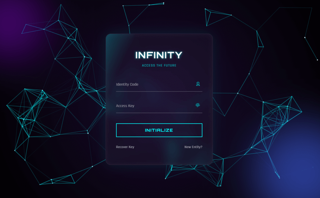
- Futuristic Login Form HTML CSS — sci-fi glassmorphism login interface, free source code
- Pure CSS Neon Button — glowing cyberpunk button with 4 colour variants
- Cyberpunk Glitch Card CSS — 3D tilt + glitch text effect, free source code
Final Thoughts
This project demonstrates something important: a well-structured HTML file is like a blank canvas that CSS can repaint completely. The switch from Classic to Modern is not a rebuild — it is a single line change in the <link> tag. If you ever need to refresh the visual direction of a site, this pattern is exactly how to do it without touching your content or your JavaScript.
Grab the code, pick your version, and drop it into your project. If you want to take it further into a real WordPress site, the child theme guide is the next logical step.
Happy coding 🗞️